My first exposure to the art of letterpress was just over seven years ago.
I was working as a graphic designer full-time and taking evening design classes at MassArt in Boston. I took an intermediate typography course with Sara Eisenman, previous Art Director and book designer at Alfred A. Knopf.
The final class was led by her husband, publisher David Godine, at his incredible letterpress studio and personal rare books library at their home. As a group, we spent the evening exploring the numerous drawers of type, making our own pieces, and soaking up the knowledge of both David and Sara.
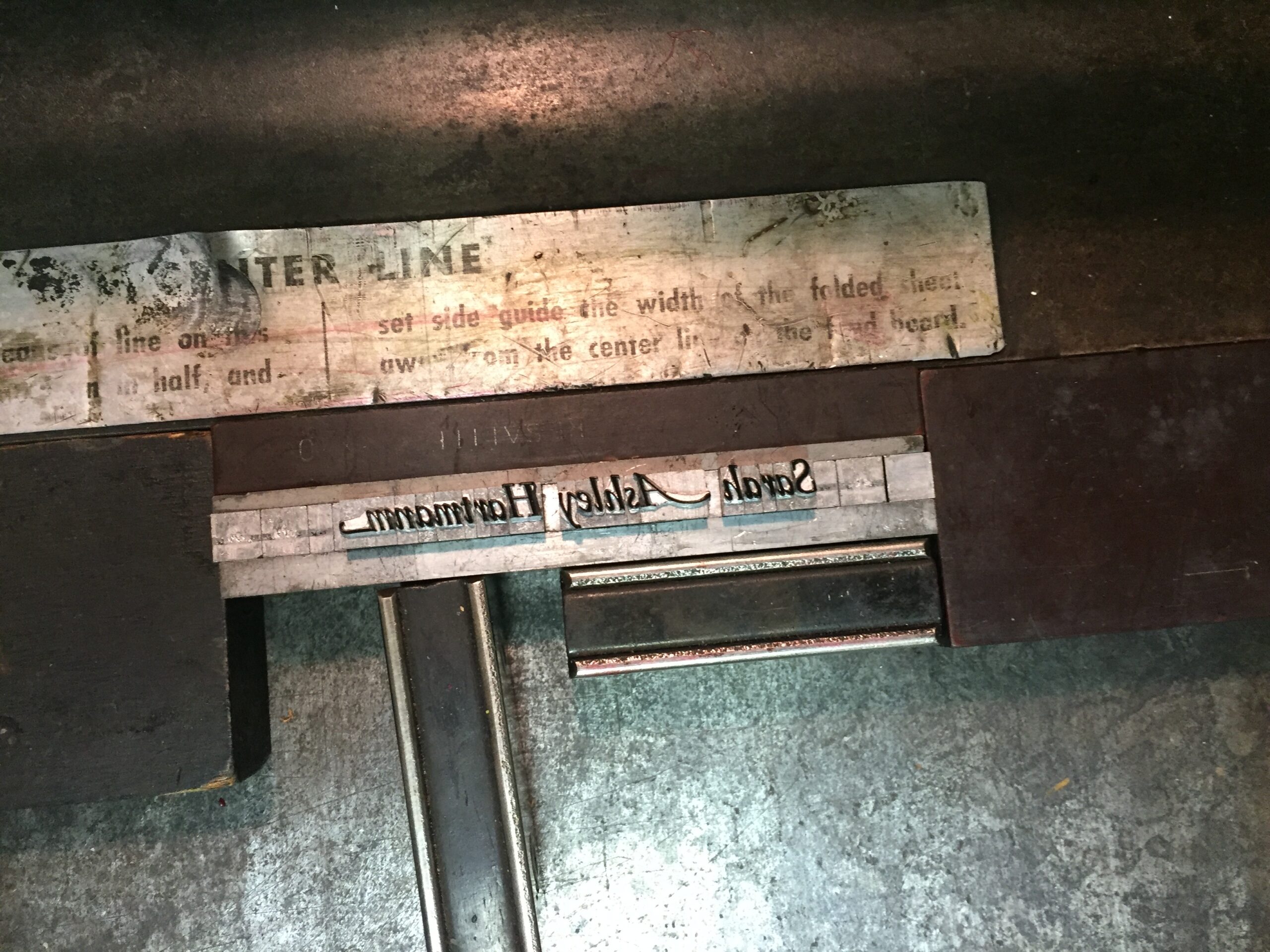
I took a spin on this massive, beautiful Vandercook and made stationary for my sister in Palatino Italic, using any swashes I could find (check out that 'A'!) — for no other reason than because I thought they were cool.
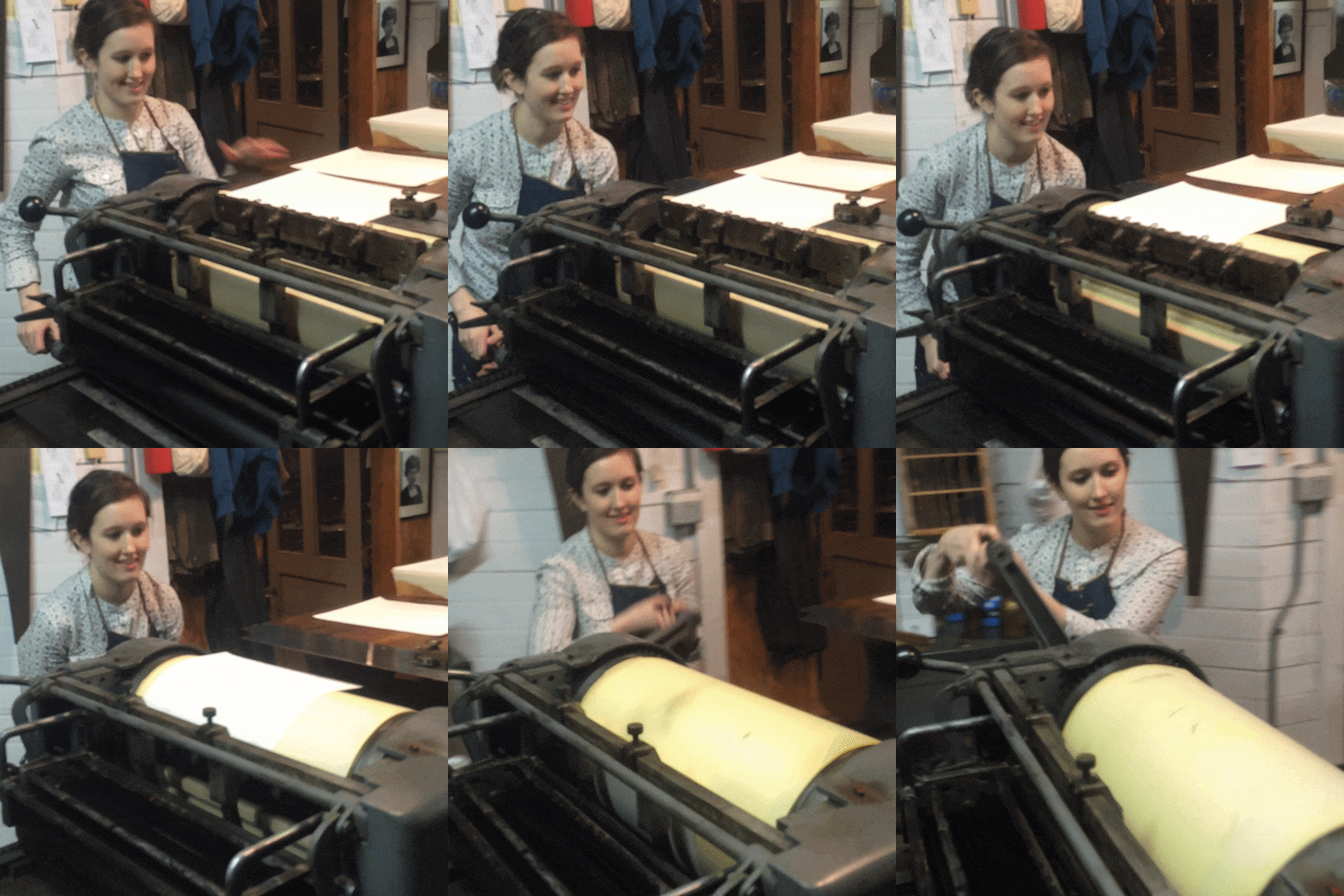
I was hooked!
Letterpress, however, isn't the easiest hobby to pick up. Acquiring a press that can weigh hundreds or thousands of pounds and finding and storing the drawers of every font size, style, and weight is a serious commitment.
So I was thrilled when a 5-week letterpress workshop at Scale House Print Shop in Hartford, VT popped up through Craft Studies. I had access to equipment, the knowledge of an instructor (Sarah, owner of Scale House), and five full weeks to make whatever I wanted.
Start Where You Are Poster
To avoid paralysis of the analysis, my first goal was to rapidly see my first project through. I used one of my favorite quotes by Arthur Ashe: "Start where you are. Use what you have. Do what you can."
This one stuck with me years ago, during one of many all-nighters as a young architecture student paralyzed by indecision on a particular project. I never forgot it, and I return to it whenever I've tricked my brain into believing I'm not ready for something due to lack of time, equipment, or whatever else it may be.
I spent the first day of the workshop exploring nearly all the drawers of type, and testing out various typefaces and font sizes in the metal composing stick:
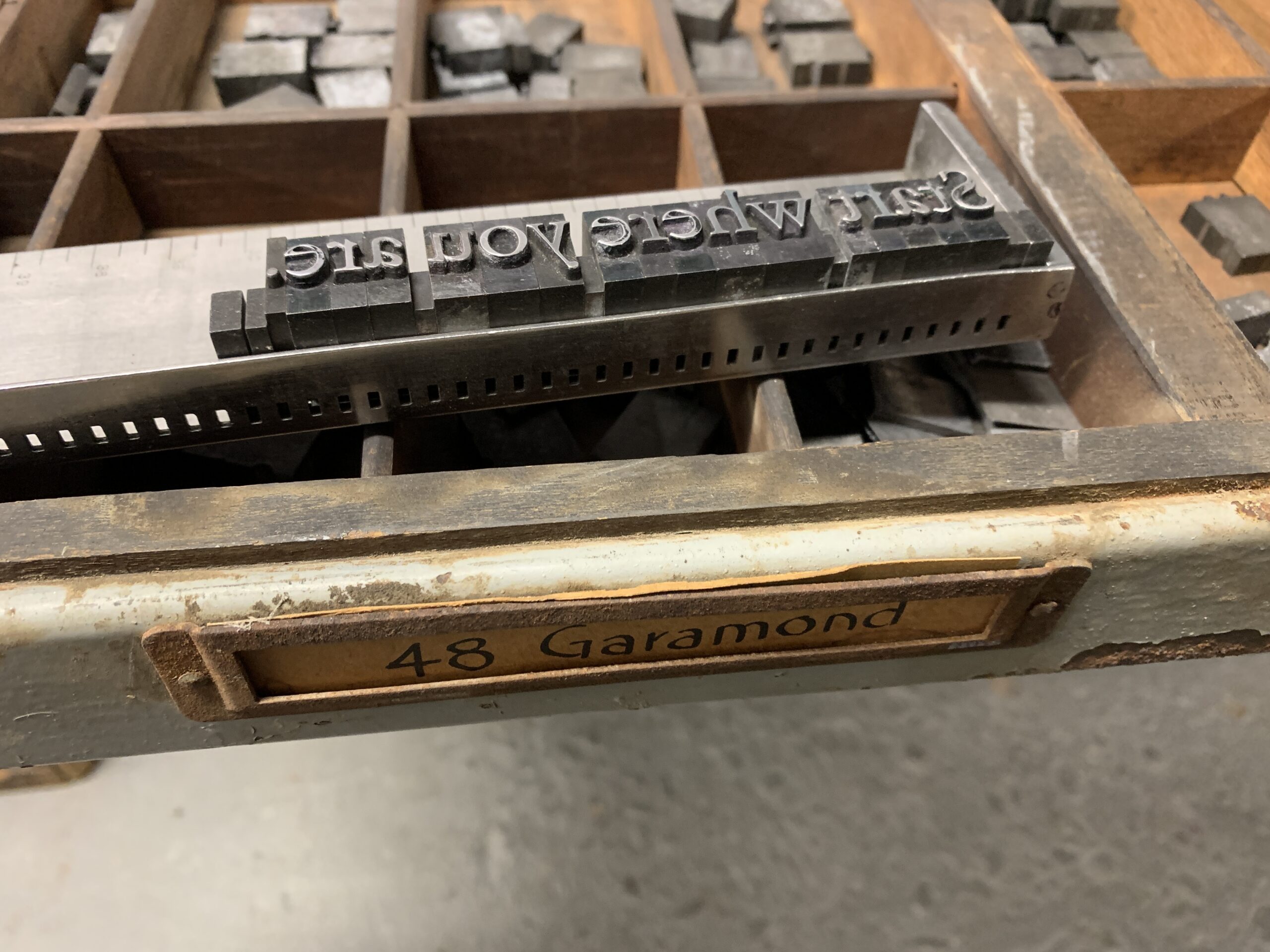
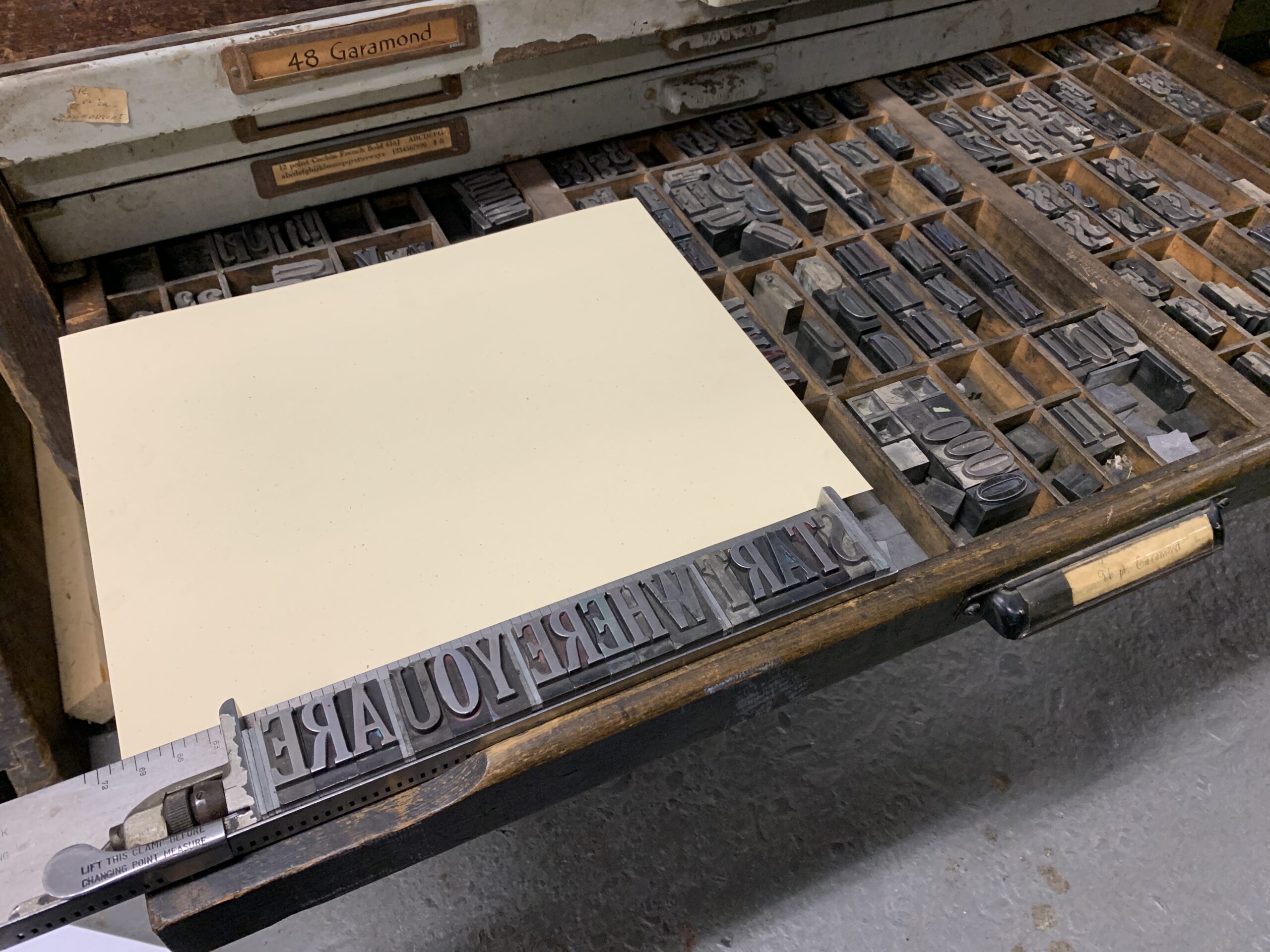
Within the first two-hour class, I landed on 96pt Garamond and this 11 x 14 off-white flecked paper — some scrap that Sarah acquired from Hatch Show Press. The following week, I finished laying out the other two lines.
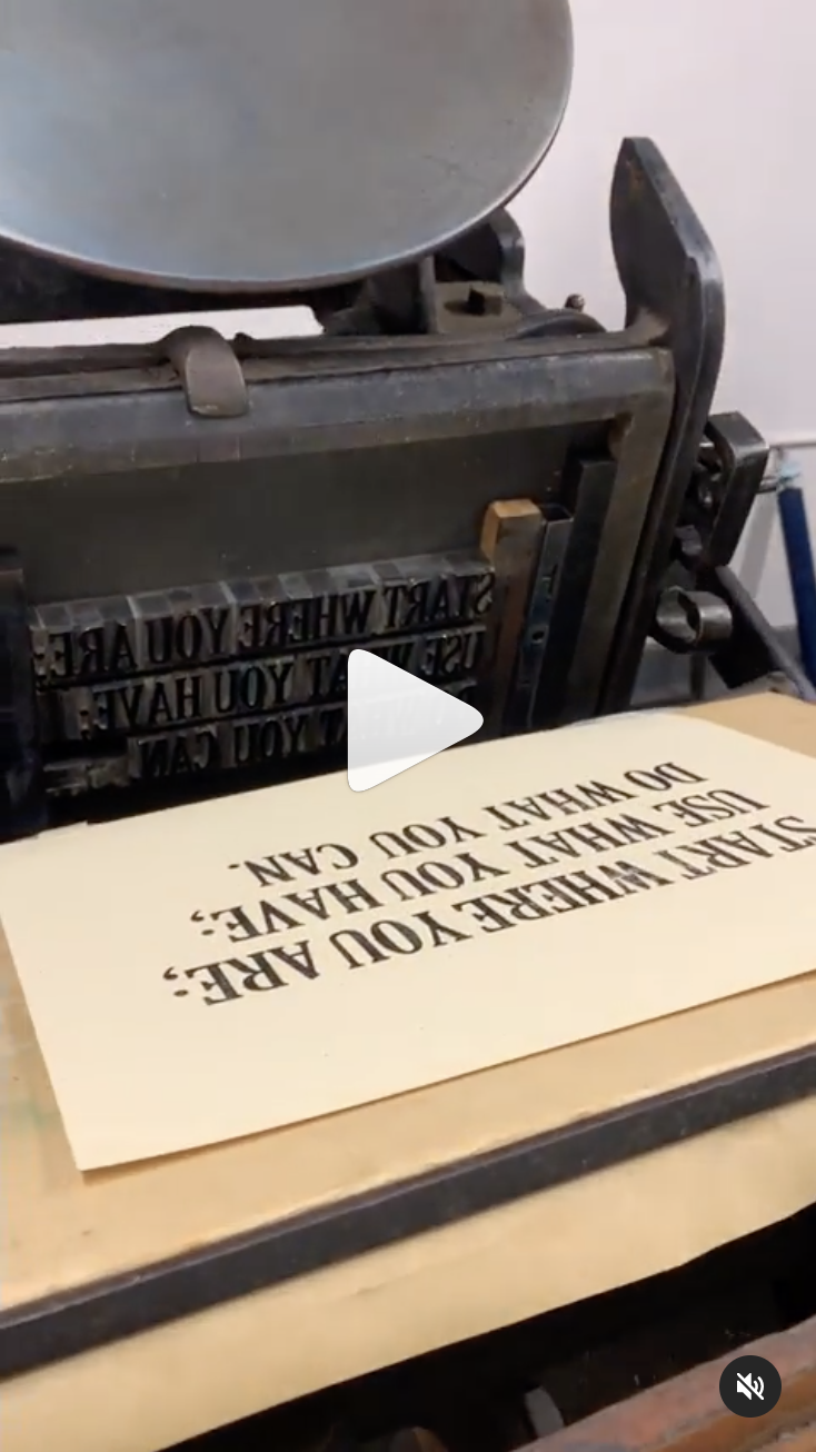
With Sarah's help, I fit this into the chase (the metal frame) with wood furniture (spacers) and set it into the Chandler & Price press. The self-inking rollers were out of order and required inking with a small handheld roller, but I loved it all the same.
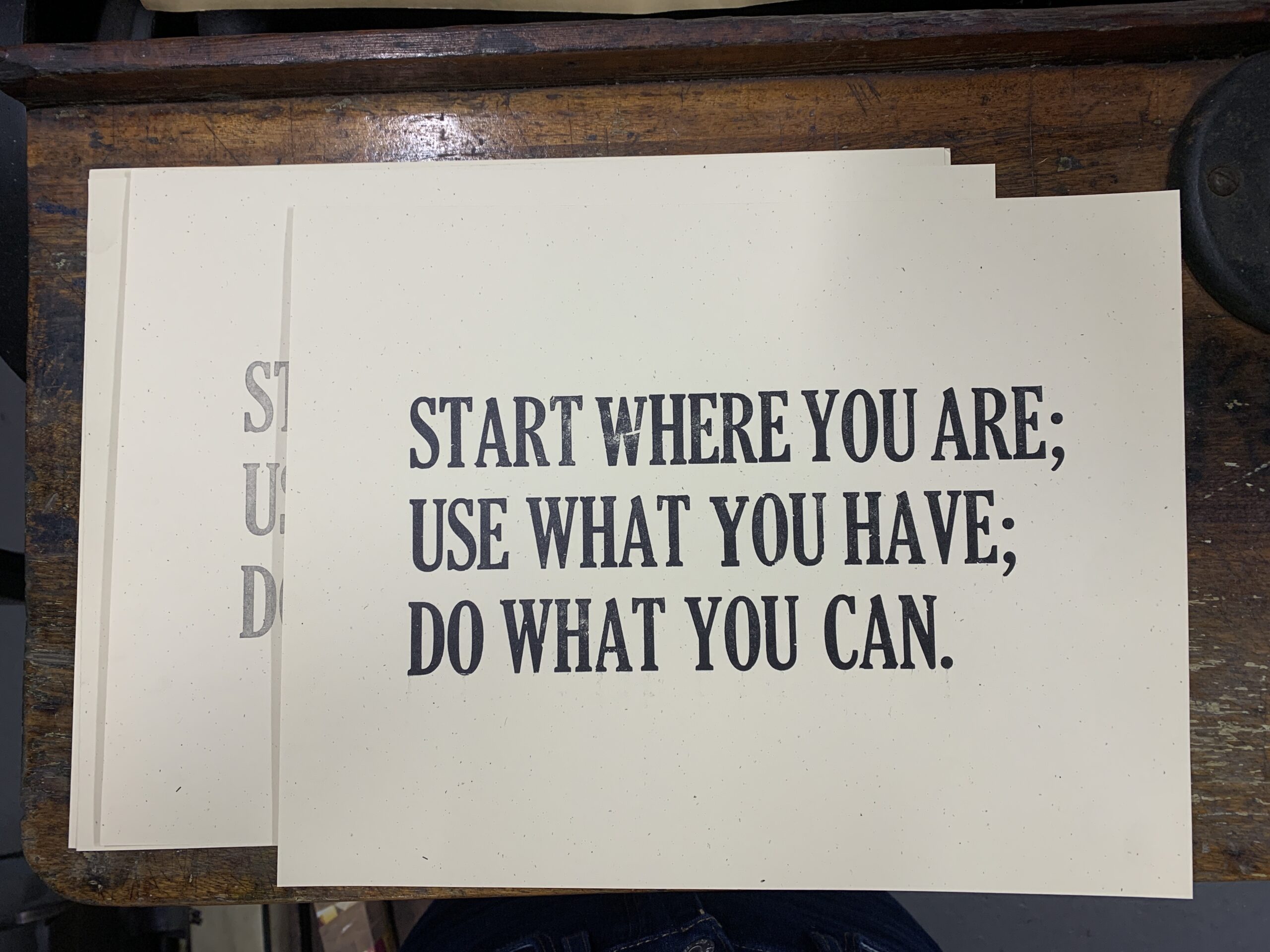
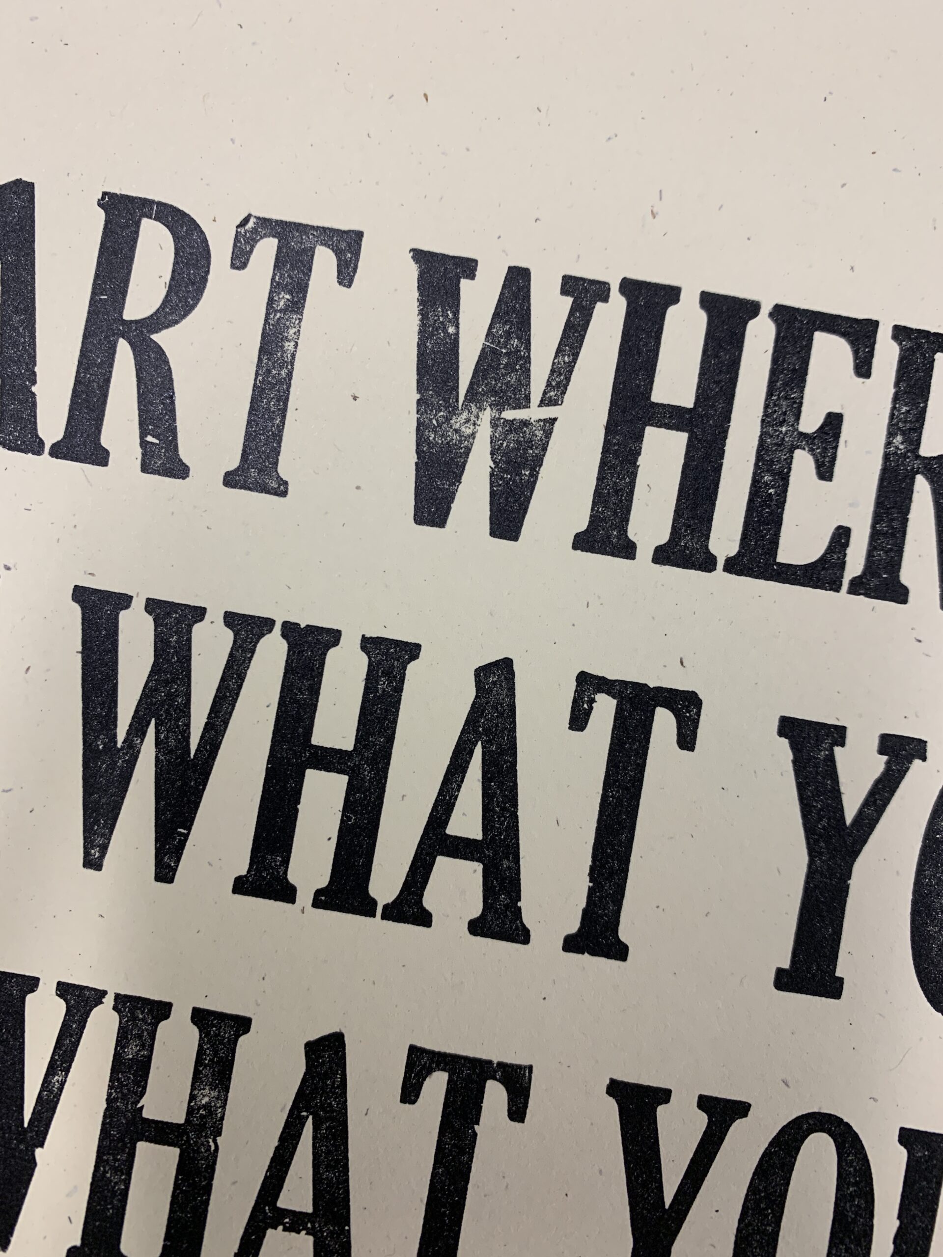
The repetition of applying the ink, inserting the paper, cranking the large, heavy wheel by hand, and seeing the results quickly became a form of meditation. I love how these turned out; especially this 'W':
Keep the Channel Open Poster
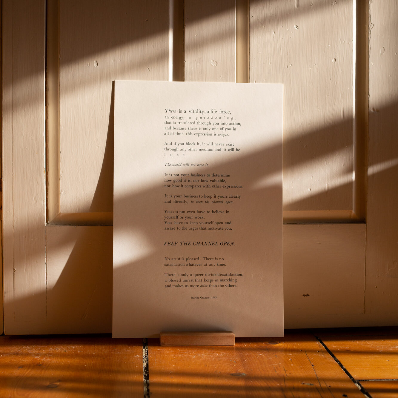
Once I had the first print under my belt, I was ready to tackle something more challenging. My husband Nick's birthday was approaching at the end of the workshop, and I ambitiously chose to surprise him with a letterpress version of the Martha Graham quote (read more in my last post here). Best case: I would gift him something personal, meaningful, unique, and handmade. Worst case: I had backup gifts!
A few things were left up to chance; I didn't know how long it would take to lay out all the lines. Would all the lettering fit in the machine? Would it fit on the paper we ordered? Would I run out of e's and s's and r's? With three weeks of the workshop remaining, I pushed these questions aside and got to work.
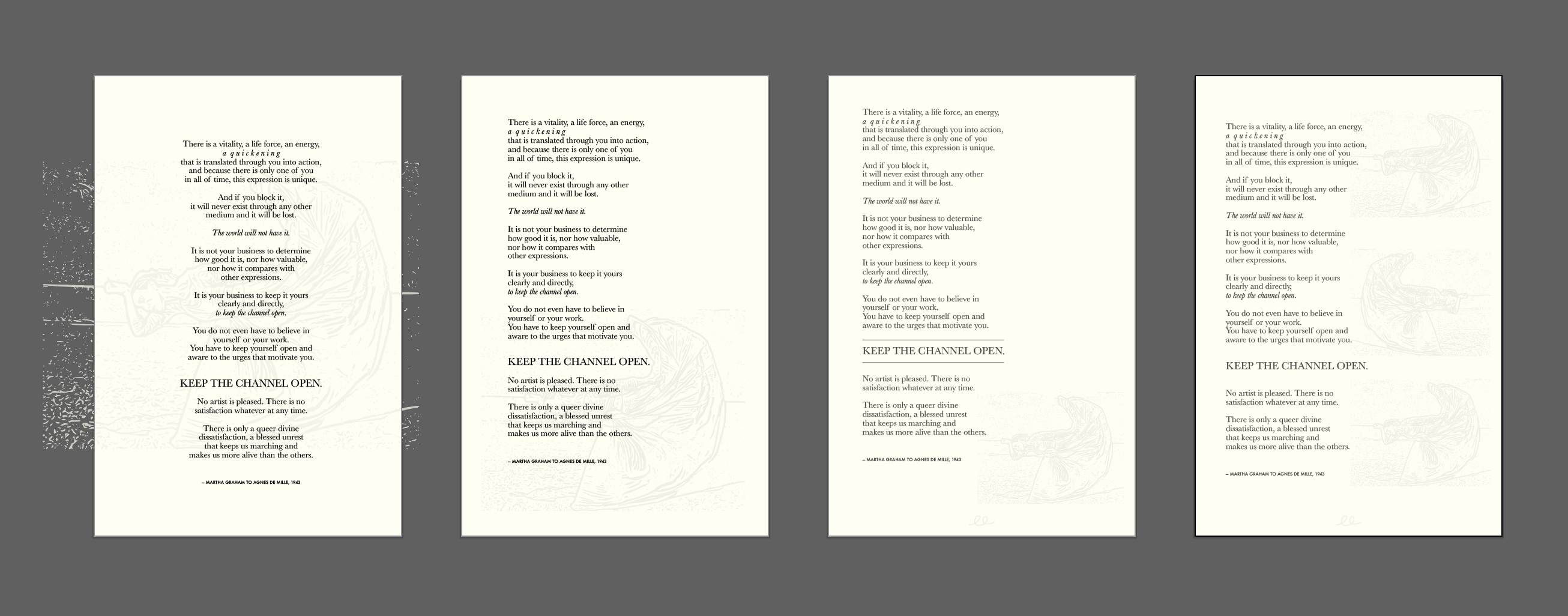
I picked Baskerville as my typeface at the studio; the drawers were well-stocked and it's one I love. At home, I laid out the full quote in Illustrator so I could find the approximate font size and line lengths in advance. This gave me the ability to move things around quickly and explore possible hierarchies before pulling any letters out of the drawer.
If you look closely, you can see where I started experimenting with the idea of a blind emboss (an impression with no ink) of a dancing Martha:
Back at the studio, I started with the longest and most important line of the type: "KEEP THE CHANNEL OPEN" — to establish the length that every other line in the quote had to match. Any shorter lines have spacers added to them.
Letter by letter, line by line, I laid out the quote from start to finish. I sat by the drawer of type pulling individual letters out and laying them backward from right to left. It's hard to get good pictures along the way with hands coated in metal, but I managed a few! All in all, it took about five or six hours.
Sarah helped me get the final piece into the chase — the largest one she had available. It took a lot of adjusting and we just barely got it in! I'm proud to say this is the largest piece made in her studio to date. 💪
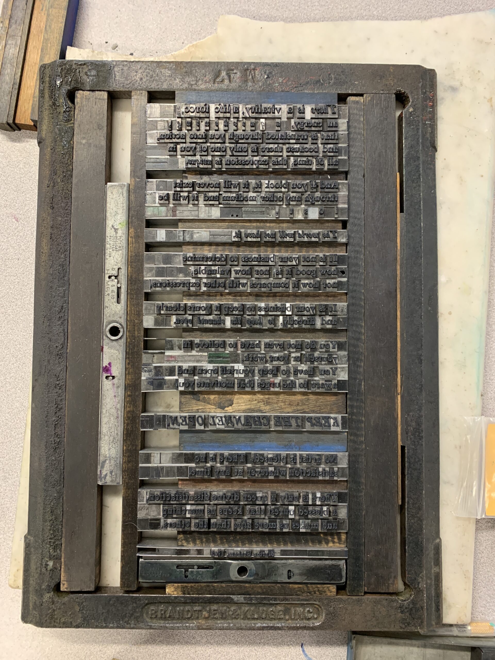
I made a few proofs by running a small hand roller with ink over the piece and pressing it with vellum paper. Tweezers were needed to pull letters out and put new ones in, and required loosening and retightening the composition each time.
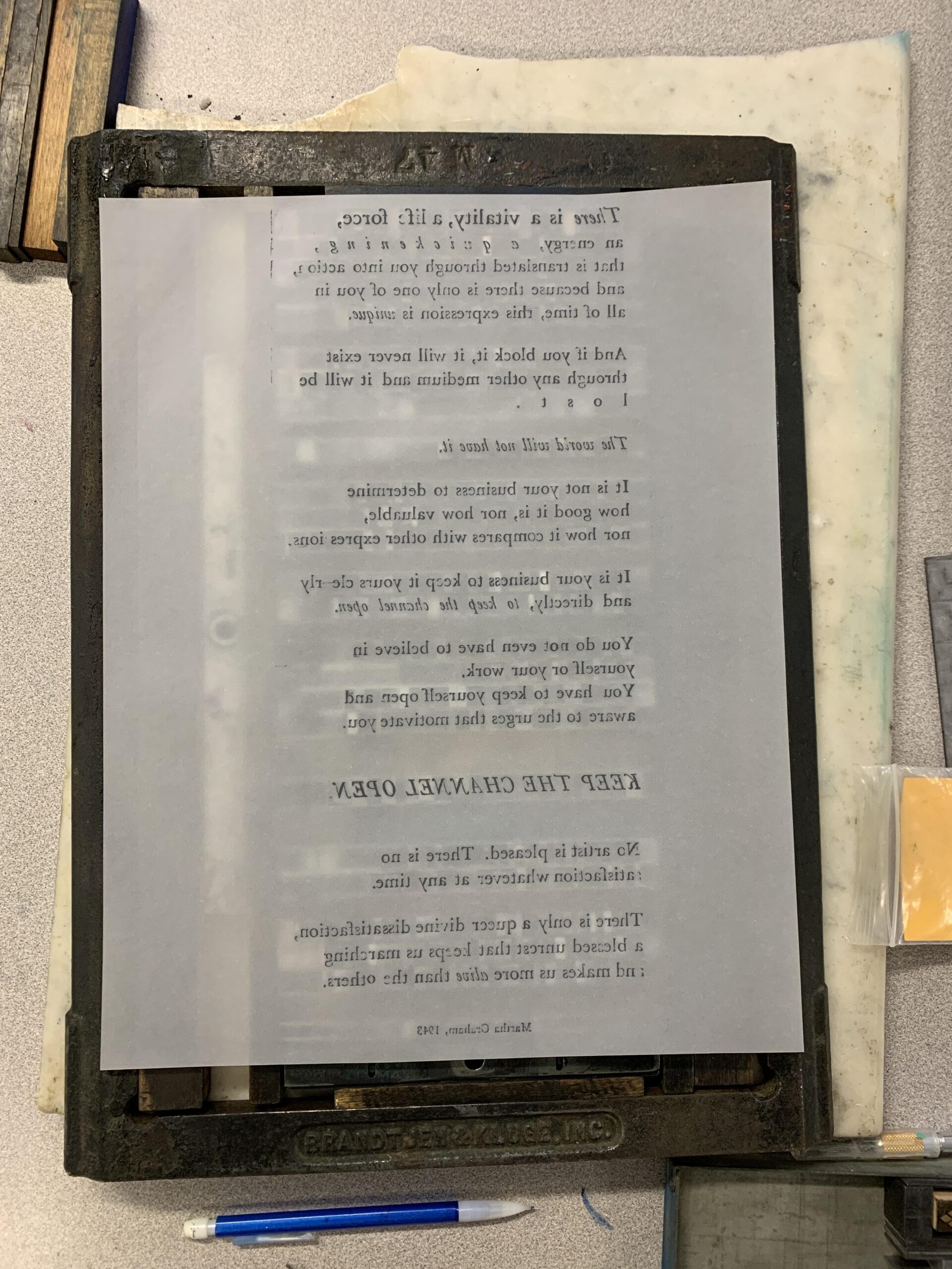
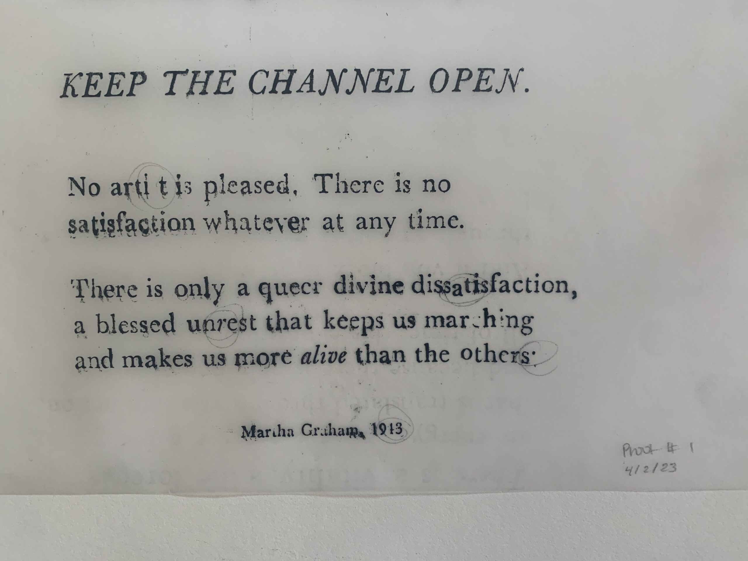
After three or four rounds of rapid revisions, into the Chandler & Price it went!
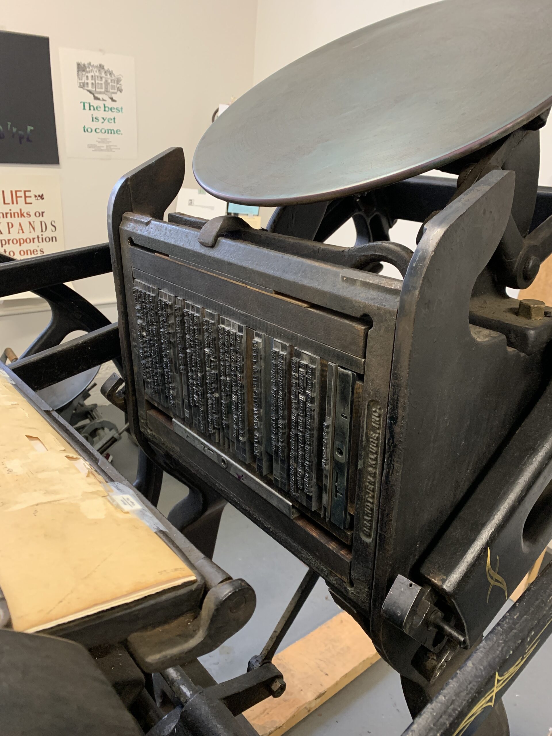
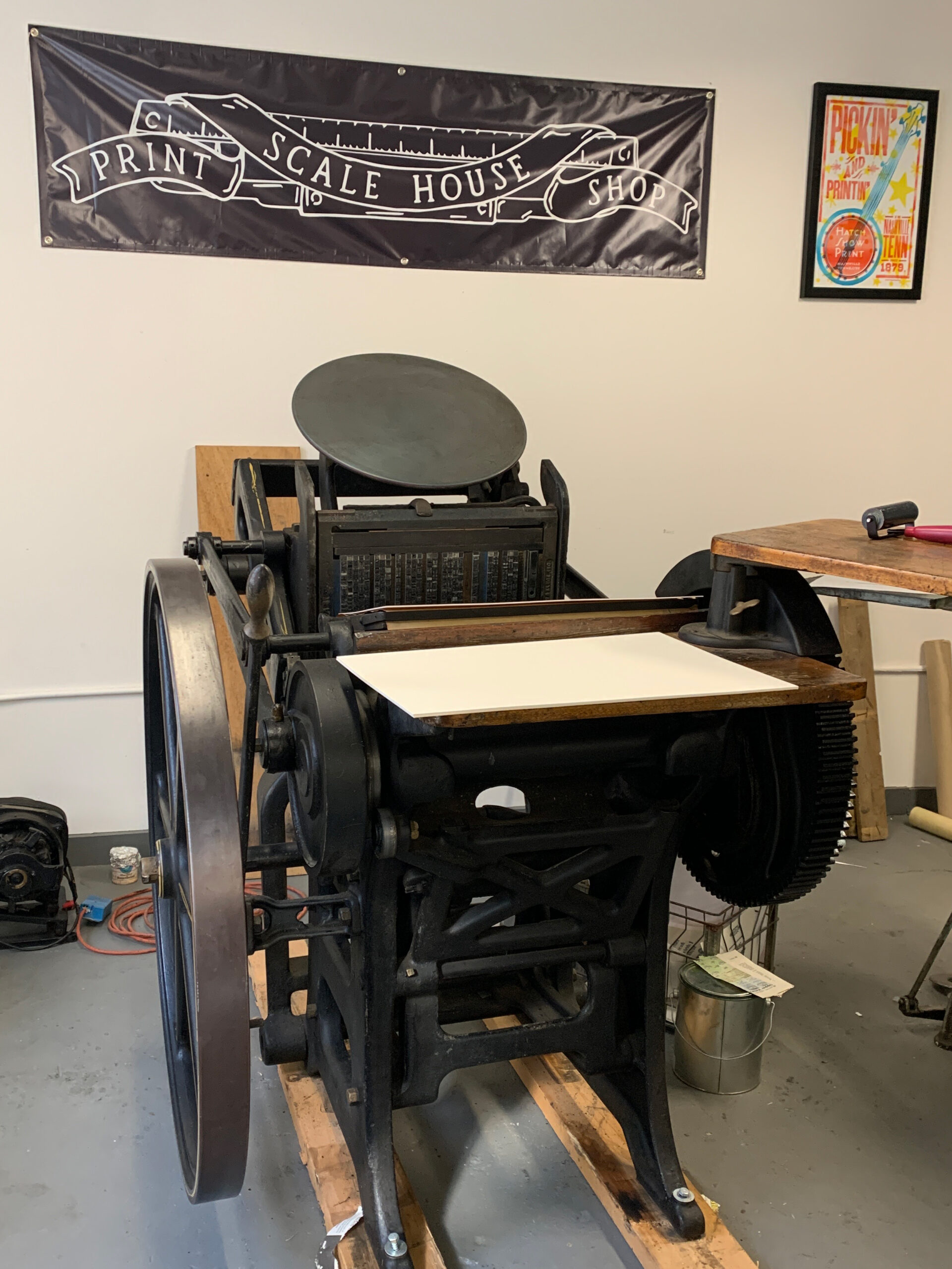
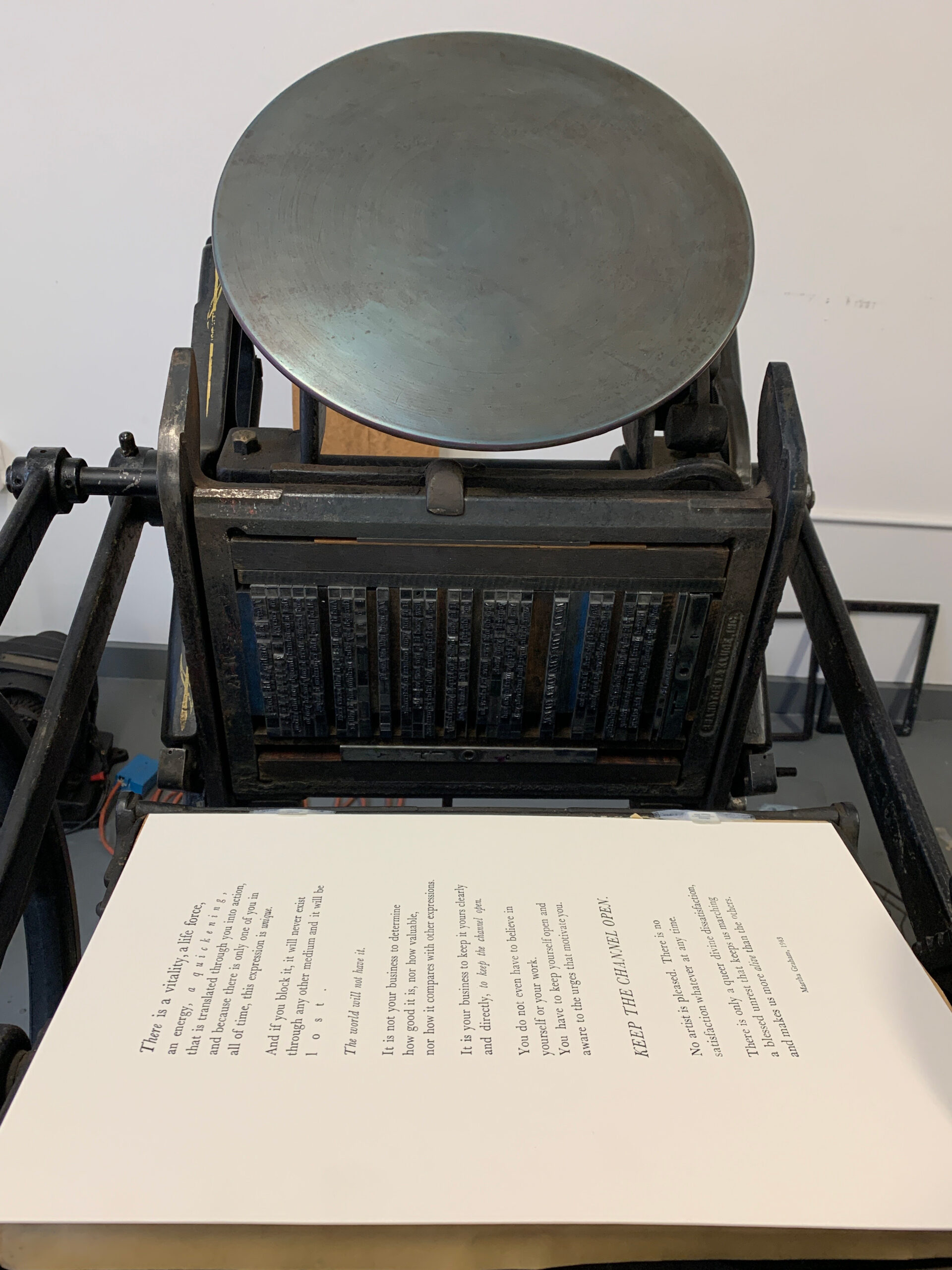
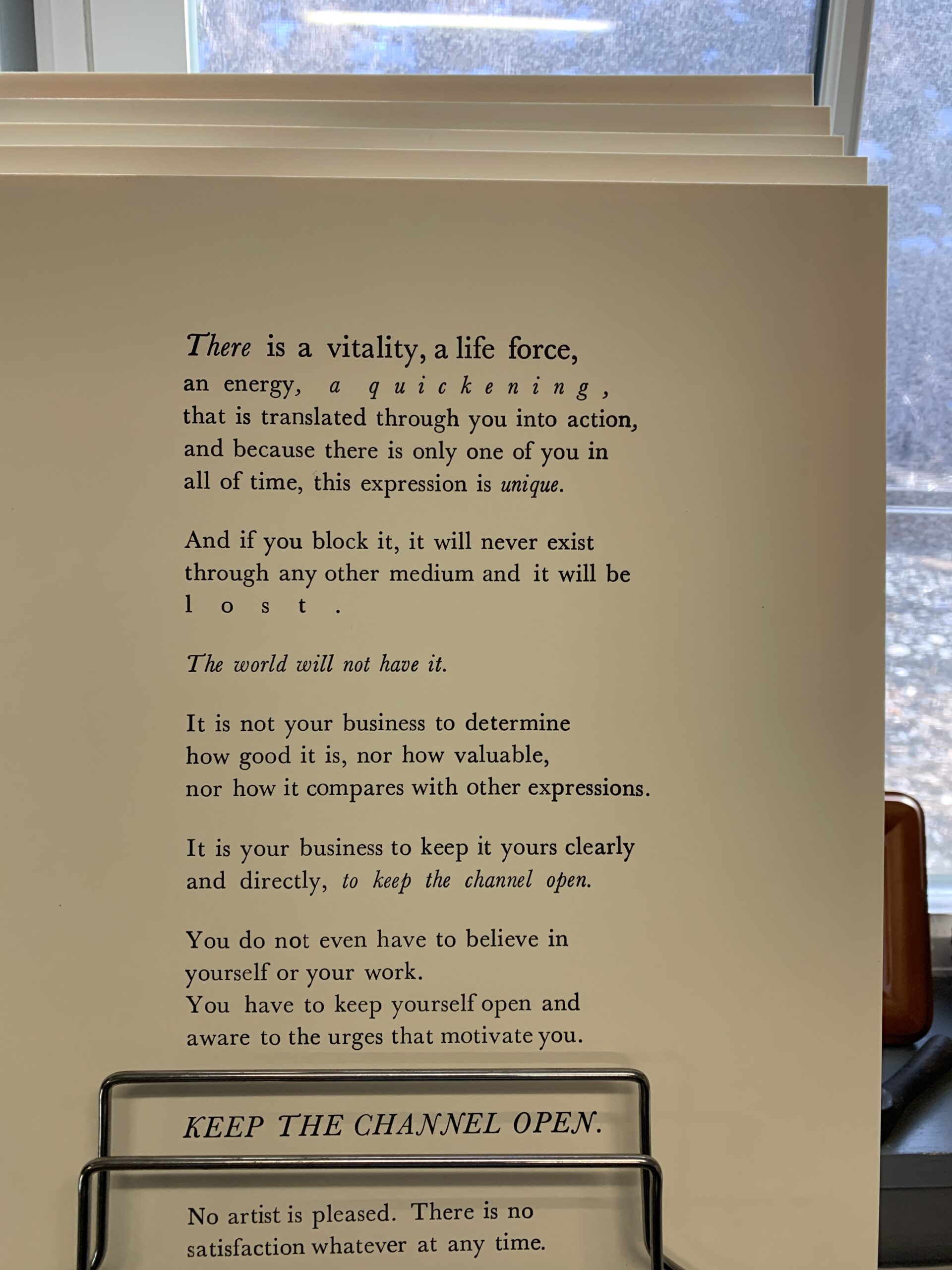
I happily spent an hour running 15 of these posters through the press; ink, paper, press, proof, repeat.
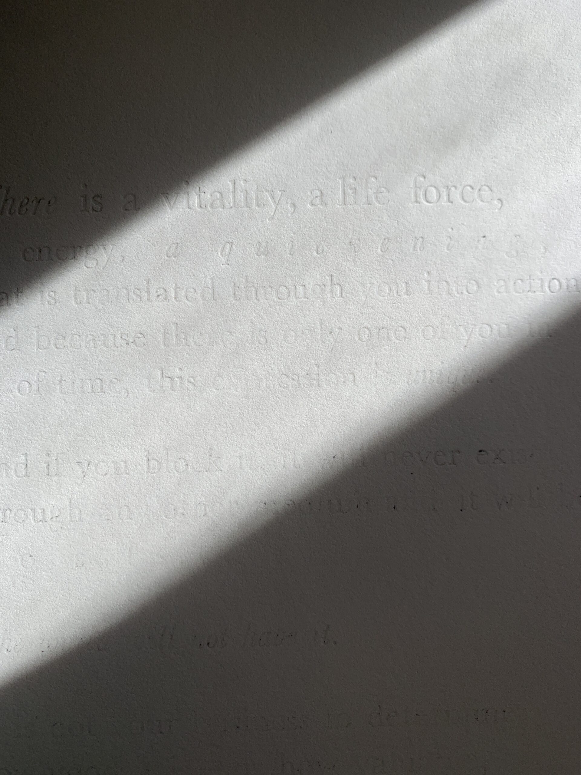
I also tested a blind emboss of the quote on a few paper thicknesses to get a sense of how the impressions come out. Sarah graciously allowed me to keep my composition together in the chase so I can experiment with a second run of prints. I am planning to try this method with a polymer plate or wood block of a Martha Graham illustration. More to come on that soon!
The small imperfections in this poster are an added bonus; I could never achieve them with the same authenticity in my digital design work. If you look closely, you can see a few things that I find especially interesting:
- The 'o' in "others" has a different baseline; a happy and ironic accident that I missed during proofing
- The spacing between words differs throughout the piece since I used whatever spacers I could find in the drawers
- The hand-inking resulted in color variations that are unique to each print
- The impression in the paper is beautifully tactile
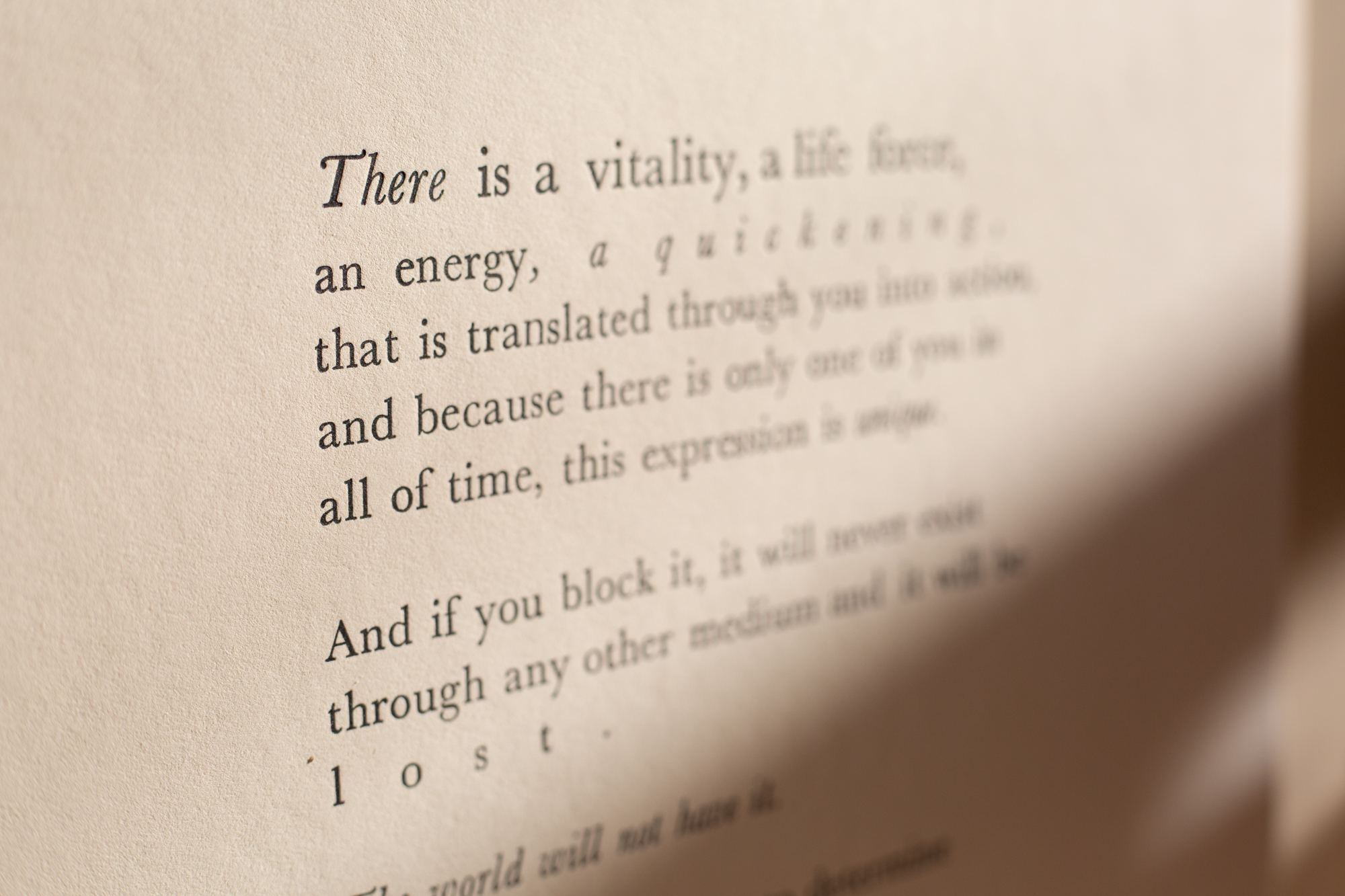
Whenever I'm feeling paralysis of the analysis in my creativity, I re-read this. I hope it resonates with you, too.
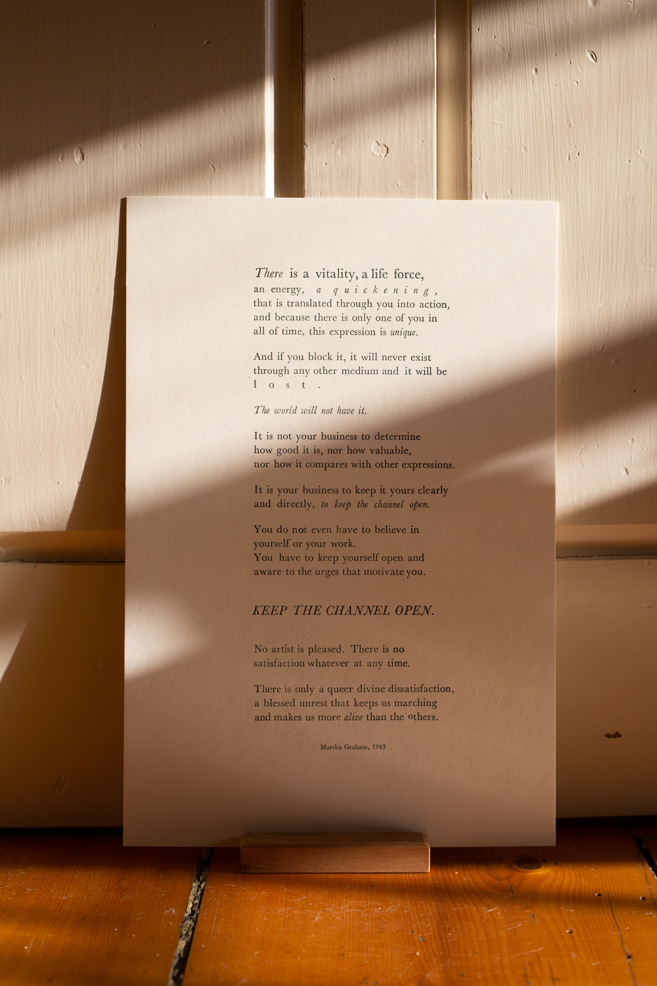
I finished these the day before Nick's birthday and gifted him print #1. Print #2 will hang in my studio. All the remaining prints went to friends and family through Instagram, who were so supportive of this project.
I am taking preorders for a second run of prints! I will be renting studio space at Scale House this summer (dates TBD). Email me at hello@erinenglishdesign.com or send me a message on Instagram if you would like a copy. These come unframed or in a custom hardwood frame out of Cherry or Walnut, handmade by Nick.
Martha Graham Letterpress Poster
12 x 18 (approximately 24 x 30 with a frame)
2-ply cotton stock from Boxcar Press: a beautiful, thick paper that can hang on its own or in a frame
Unframed: $35 plus shipping
Cherry Frame with Black Mat: $240 plus shipping
Walnut Frame with Black Mat: $275 plus shipping
Printed on a Chandler & Price at Scale House Print Shop in WRJ, VT
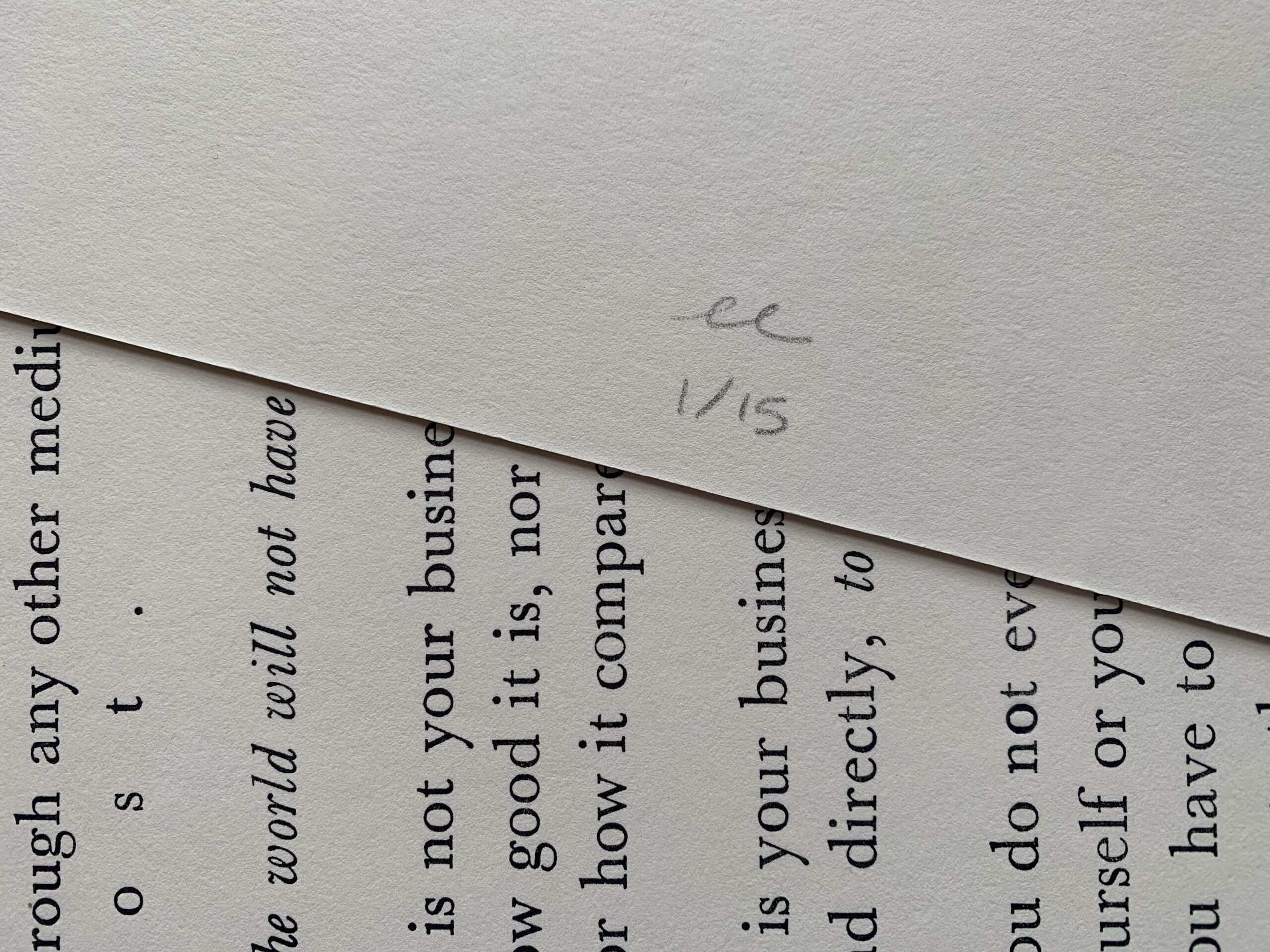
Design never happens in a vacuum. Thank you to Sarah at Scale House Print Shop for opening your studio to me, and David Godine & Sara Eisenman for an incredible introduction to letterpress.
No Comments.