→ Brand Identity, Logo Design, Website, Print Materials, Digital Materials, Video, Photography
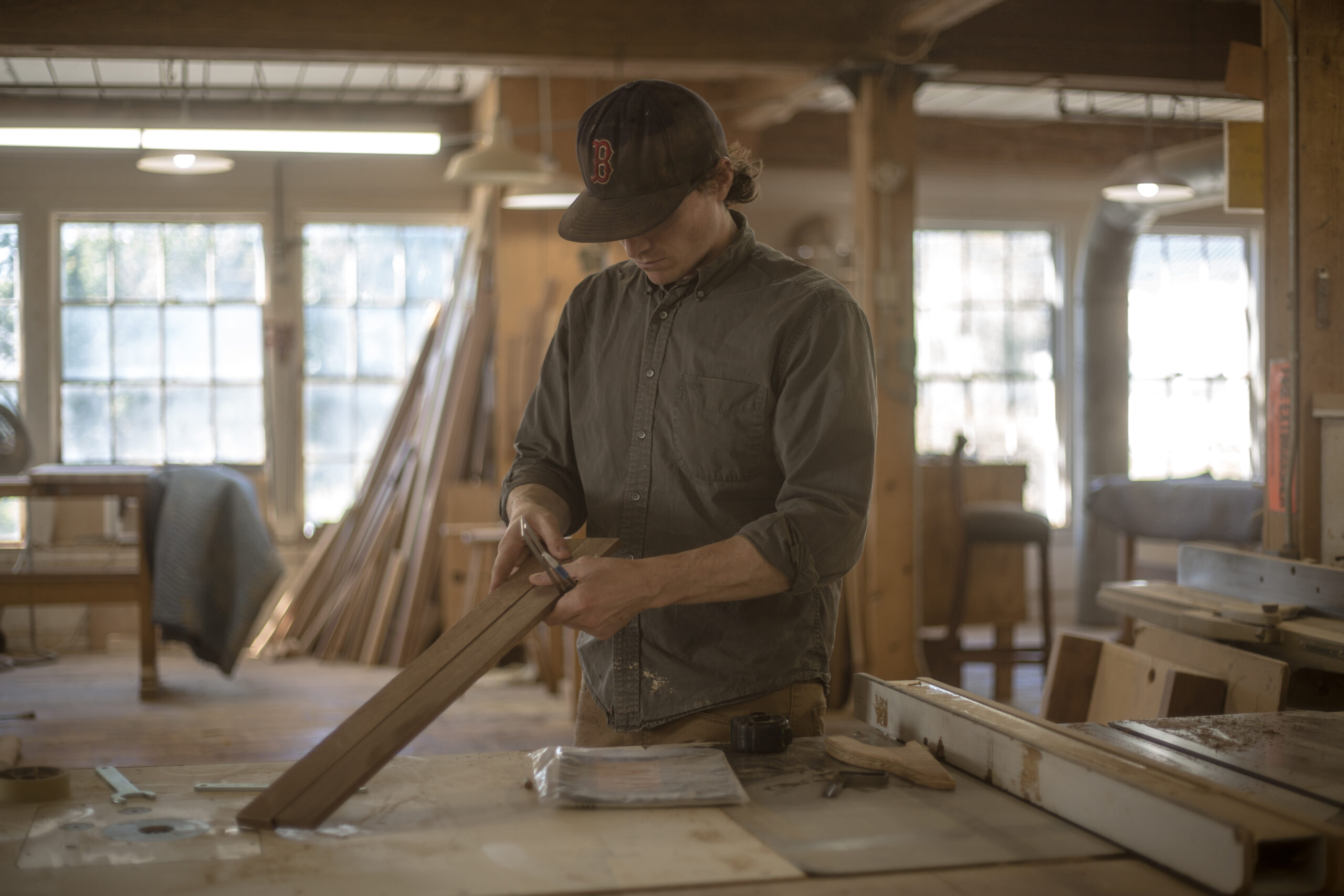
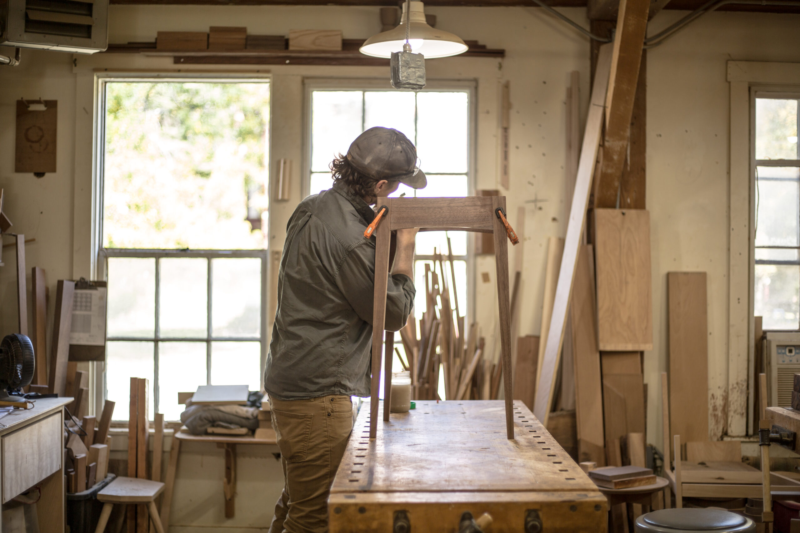
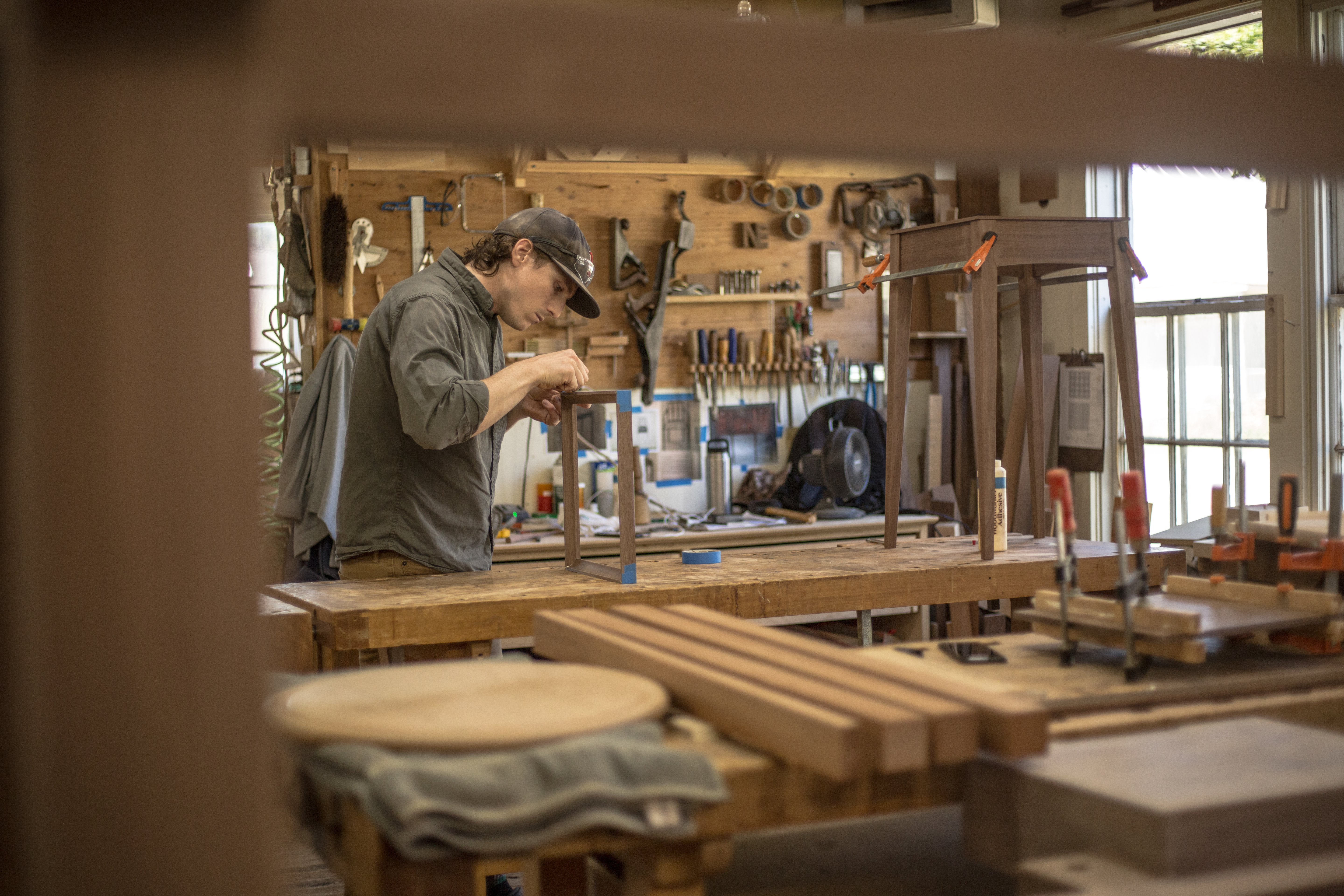
Nick English is a fine furniture maker and woodworker in Vermont. Together we run Petite & English, selling his work online and at local maker markets as a husband and wife team.
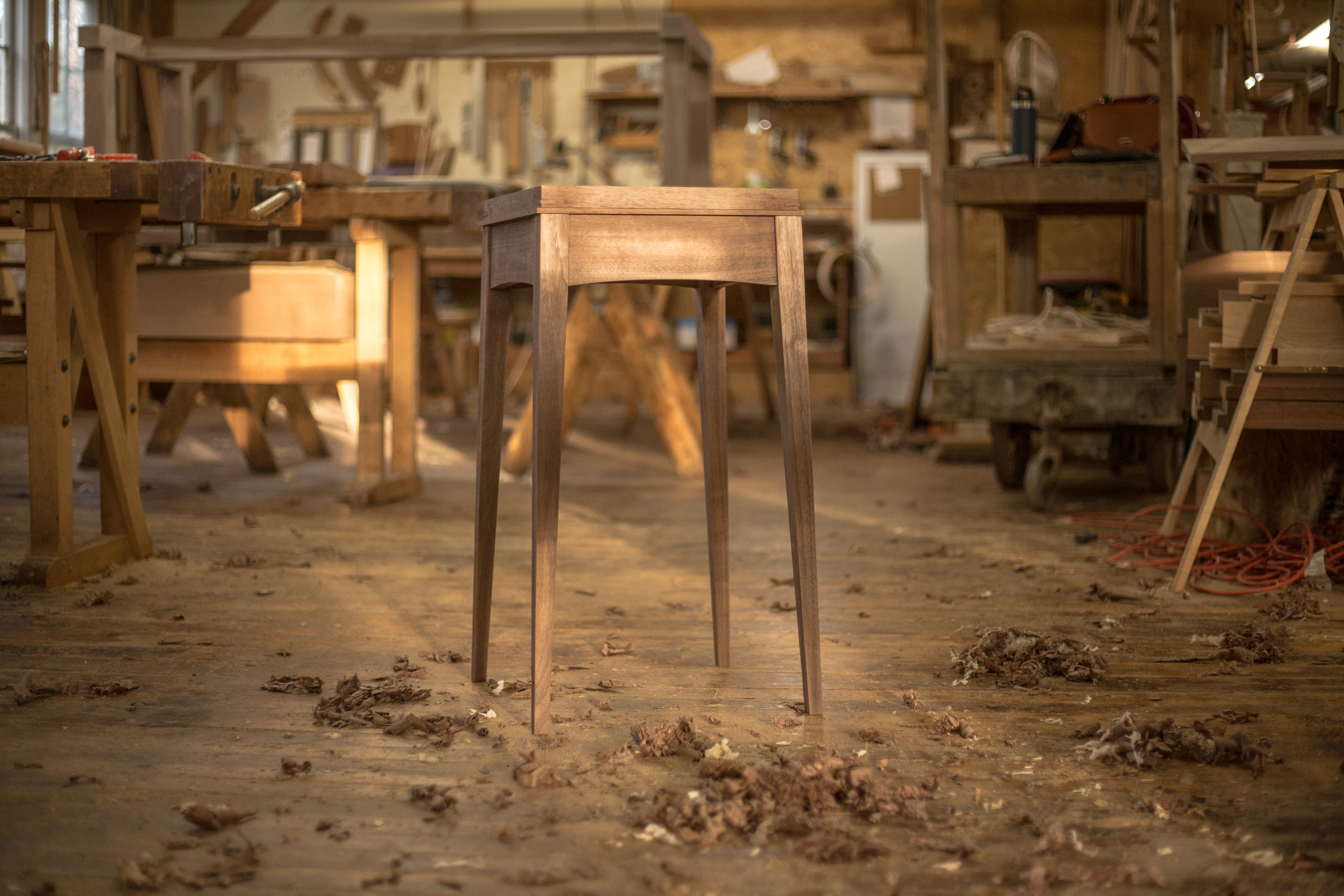
Previously known as Hone Design Co. and run as a sole proprietorship, we worked together in 2020 to rebrand this into our small family business and creative outlet. Nick designs and builds handcrafted pieces inspired by the traditional Shaker, Federal, and Scandinavian styles. I document the making process through video and work with him on design, marketing, and other behind-the-scenes operations of the business.
All photos by Erin & Nick English
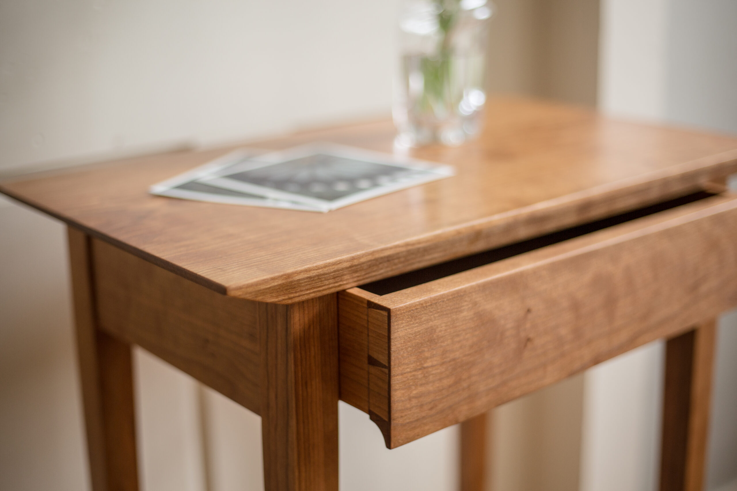
The Making of the Maynard Desk ‧ April 2020
2015
2018
2020
New Name & Logo Design
We moved to Vermont from Boston in 2018 to leave behind the city hustle and live a slower, more focused pace of life. Petite & English is a reflection of this intent. Our goal is to have and make fewer, well-made things that are designed to last generations. While Hone focused on hospitality and other commercial projects, Petite & English focuses on the home.
The original Hone Design Co. logos were our early attempts to create a brand identity without a full understanding of who we were and what we wanted to say. To us, the tree rings became overused and too specific (and hard to see at small sizes!).
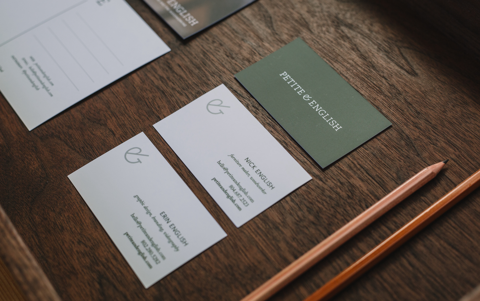
After exploring a number of designs — from illustrated hand planes to minimalist monograms — we decided to forgo an image-based logo in favor of a logotype. We felt this would allow the business to be open to other creative ventures with woodworking still being the core of the business. The humanist slab serif feels, to us, both traditional and modern while being warm and friendly. It honors the tradition from which the furniture is inspired but the future that we're carrying the traditions into.
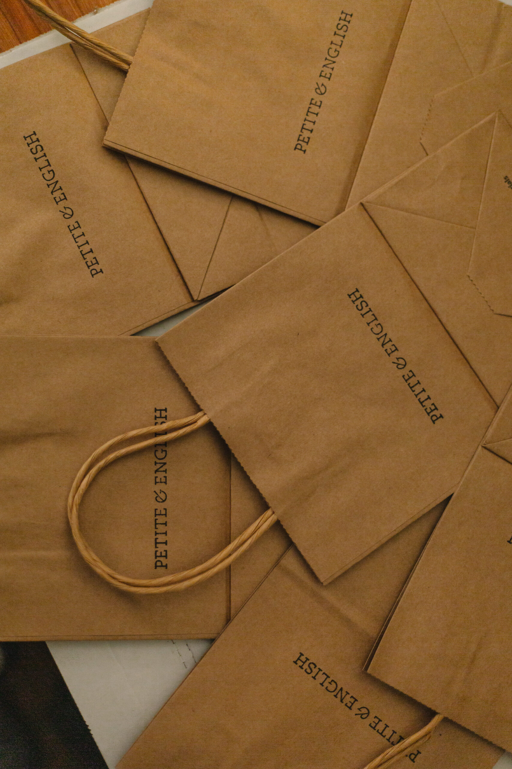
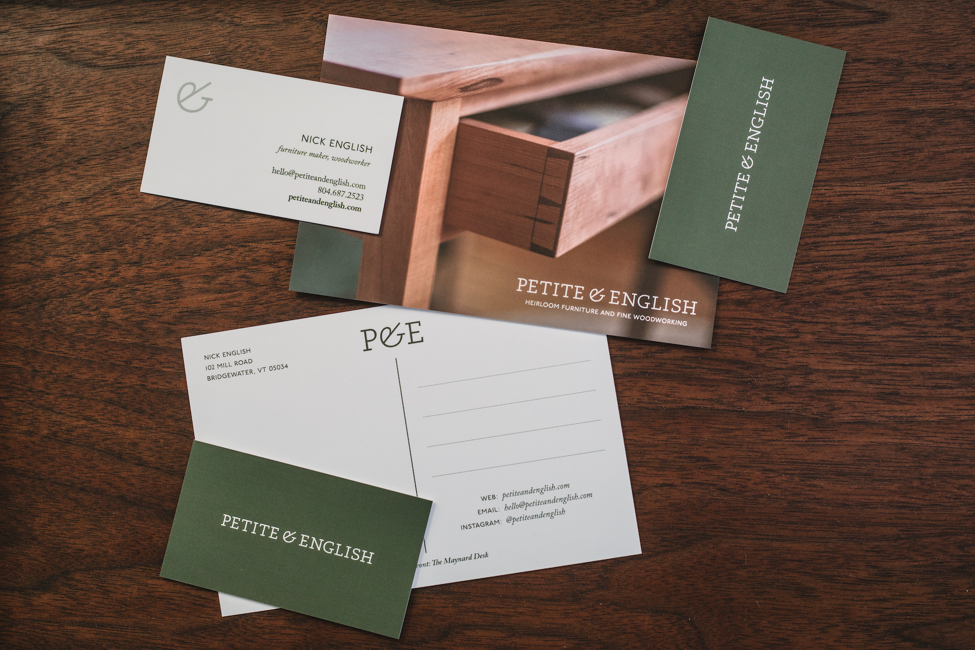
The name is reflective of us: English being our last name, and Petite meaning our small family business. Used on its own, the ampersand has become a simple visual representation of our work together.
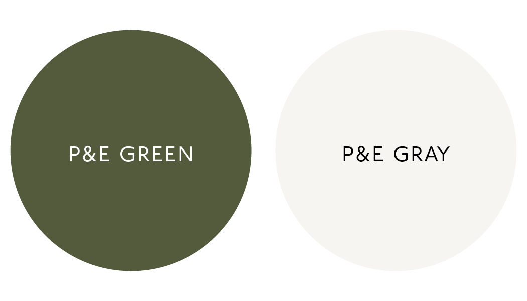
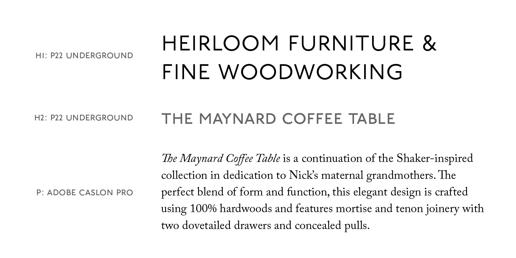
Color & Typography
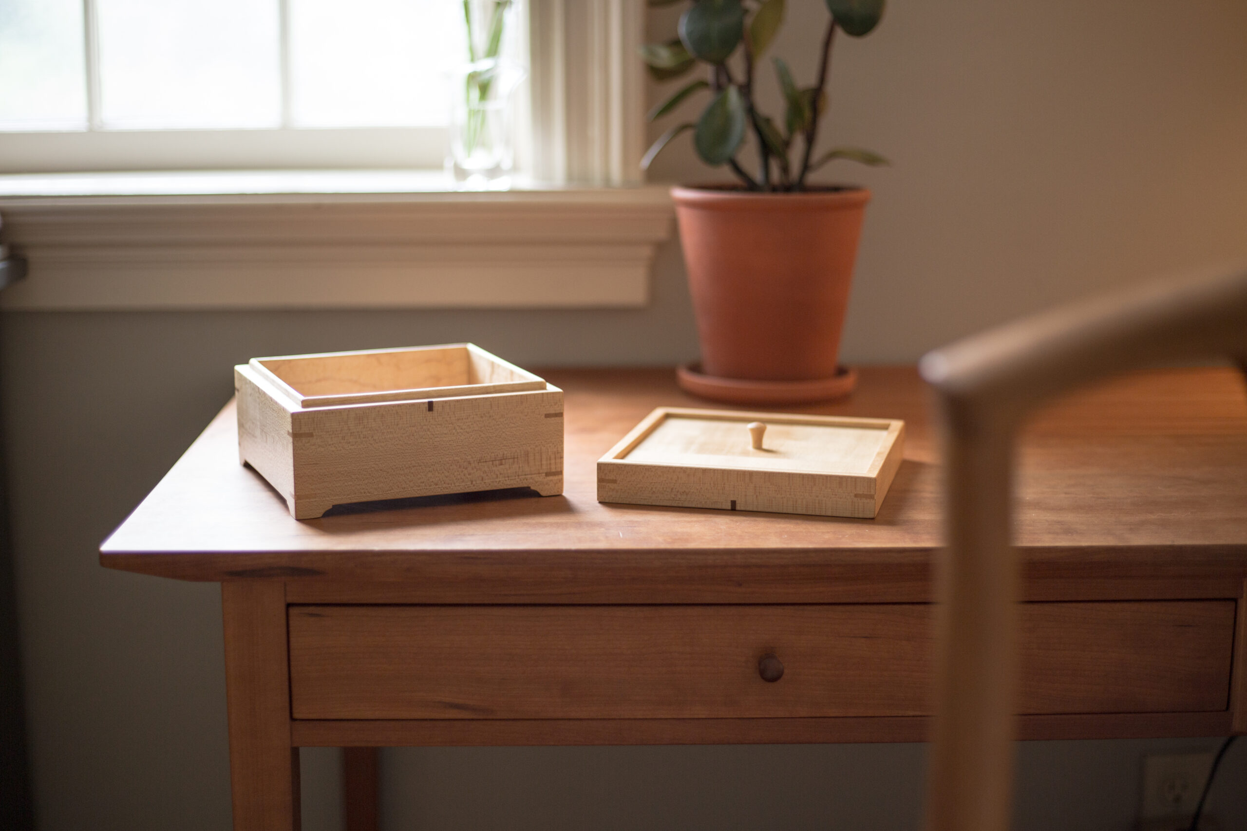
Our signature green is inspired by images found in traditional furniture, architecture, and design books. We were especially drawn toward the historical, muted Shaker colors. Our aim, like the logo, was to use a warm and friendly color based in tradition but with a modern feel. All of our imagery, shot by us, uses warm, yellowy tones to further accentuate that feeling of home and hospitality.
P22 Underground, a sans serif, and Adobe Caslon, a traditional humanist serif, felt like a perfect pairing of past and present for our brand typography.
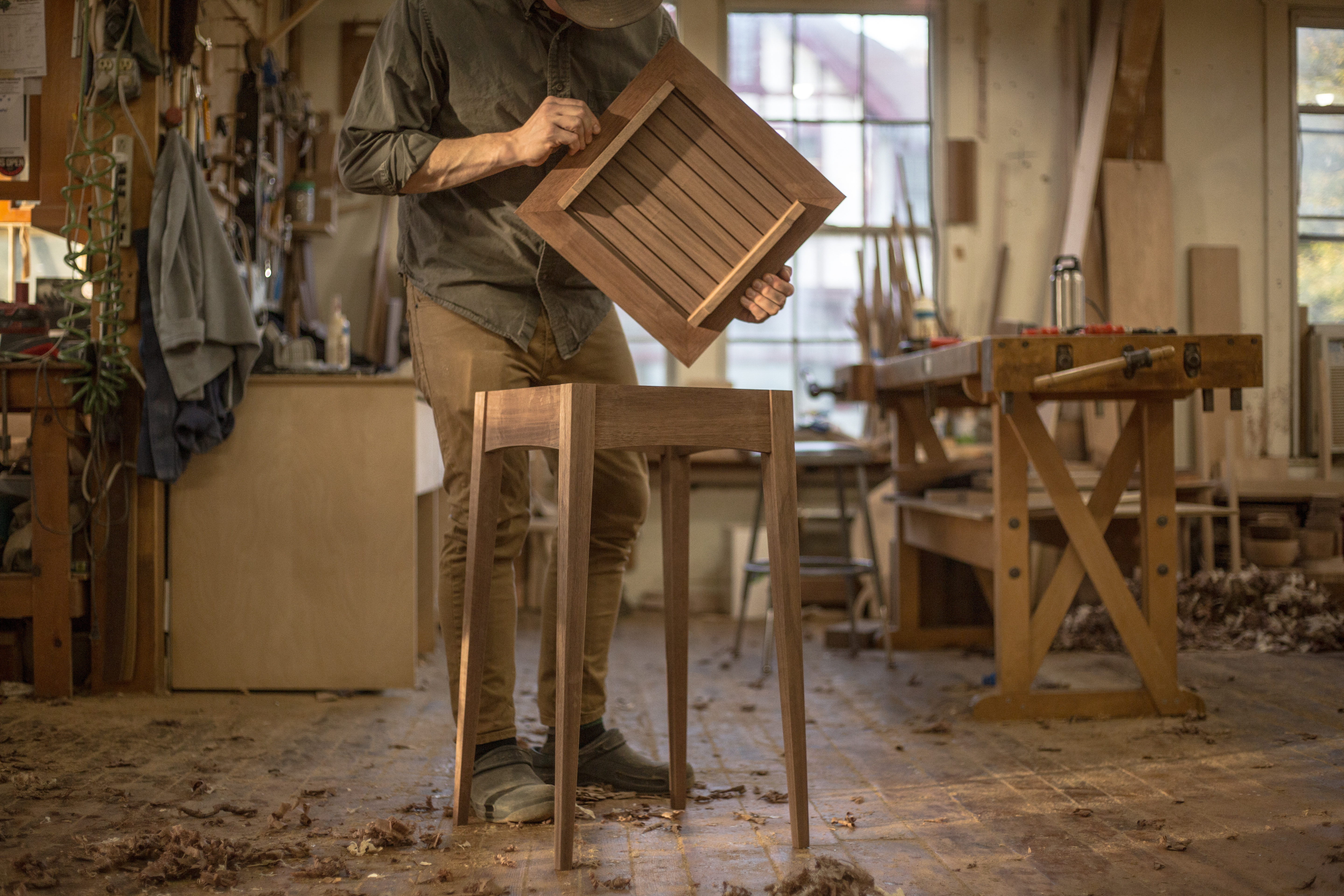
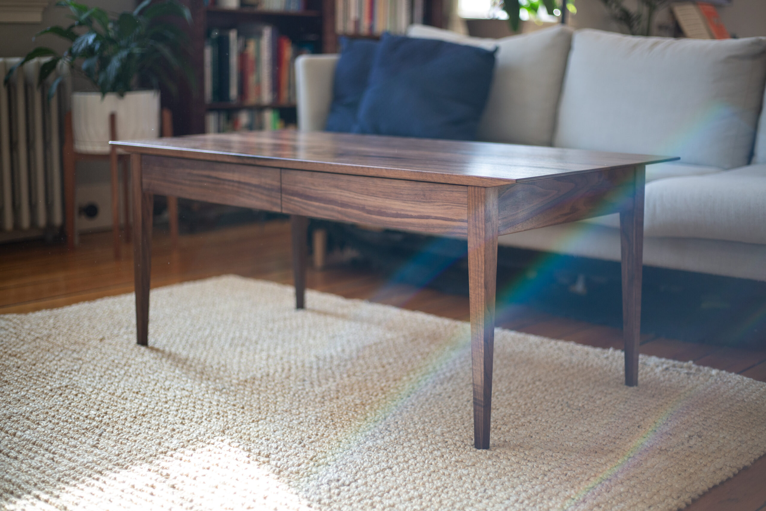
The Making of the Derby Table ‧ Summer 2021
“
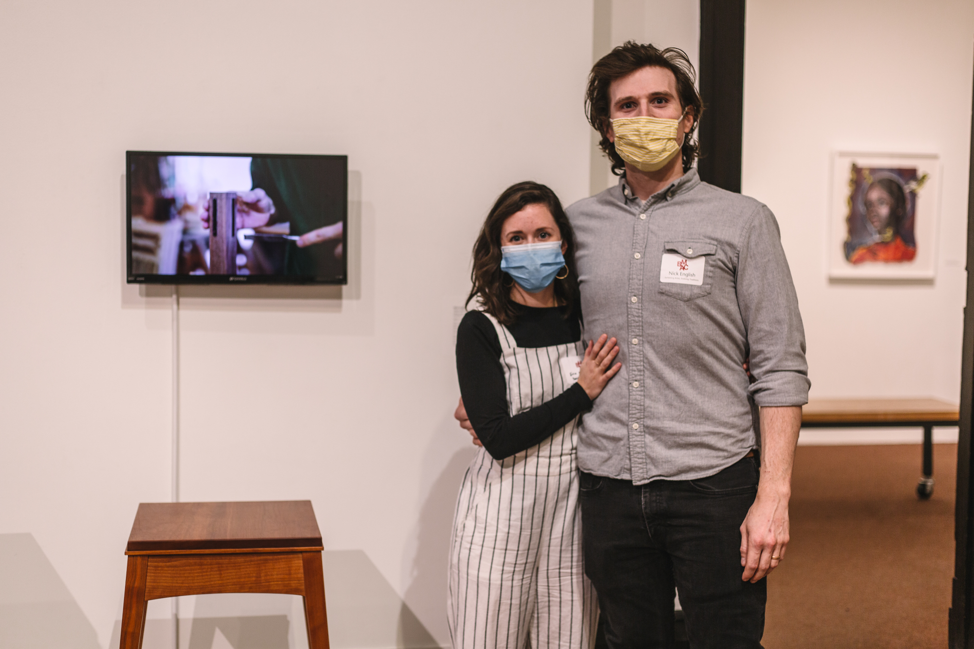
Nick English (Bridgewater VT) has been working on the Derby Tea Table (below). Spare, beautiful lines, and a video shot over three days by Erin English that is nothing short of magical. The video is part of the BMAC exhibition because it shows “the complexity and craftsmanship behind each piece.” Watching Nick English construct a table is what you need with your morning coffee.
”
Susan Apel, Artful Newsletter (read here)
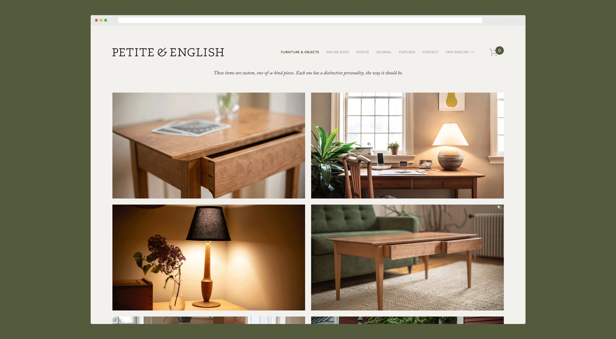
Website & Collateral
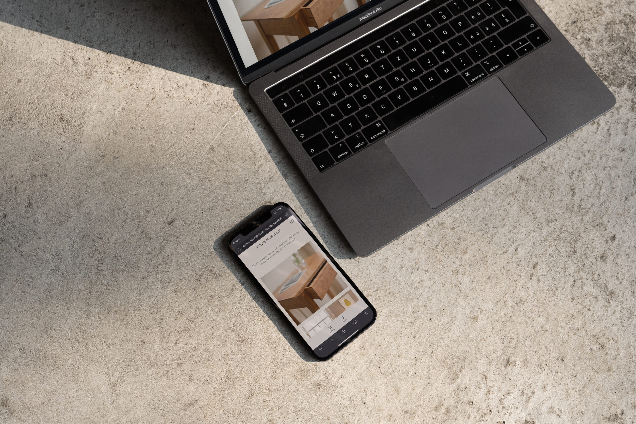
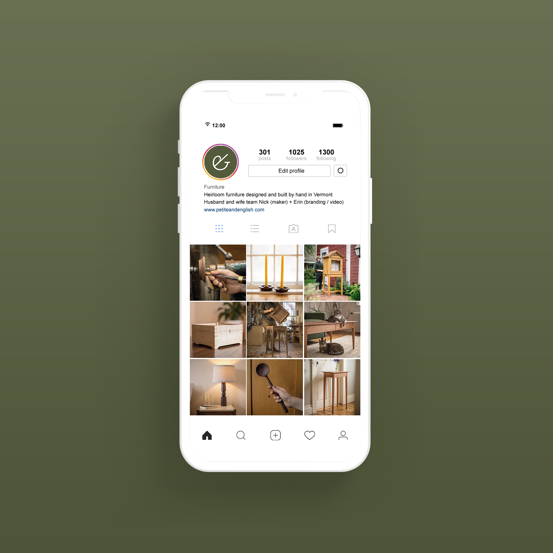
After "finalizing" the brand identity (the work is never really done!), I worked on a full redesign of the website in Squarespace. The site includes a gallery of custom work, a blog, and an online shop with our goods for sale. The landing page features a full-screen video of Nick at work (shot and edited by me), creating a visual connection from the maker to the final products. See the website here.
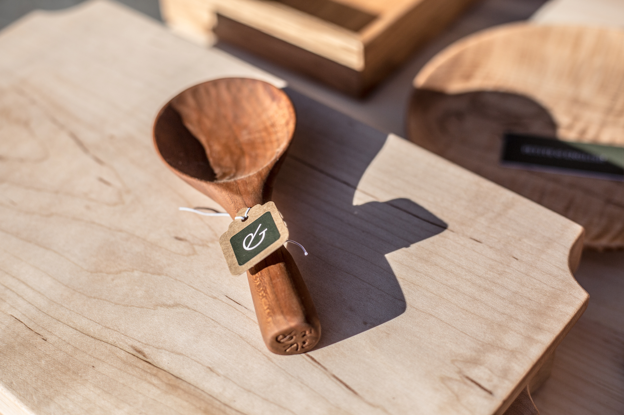
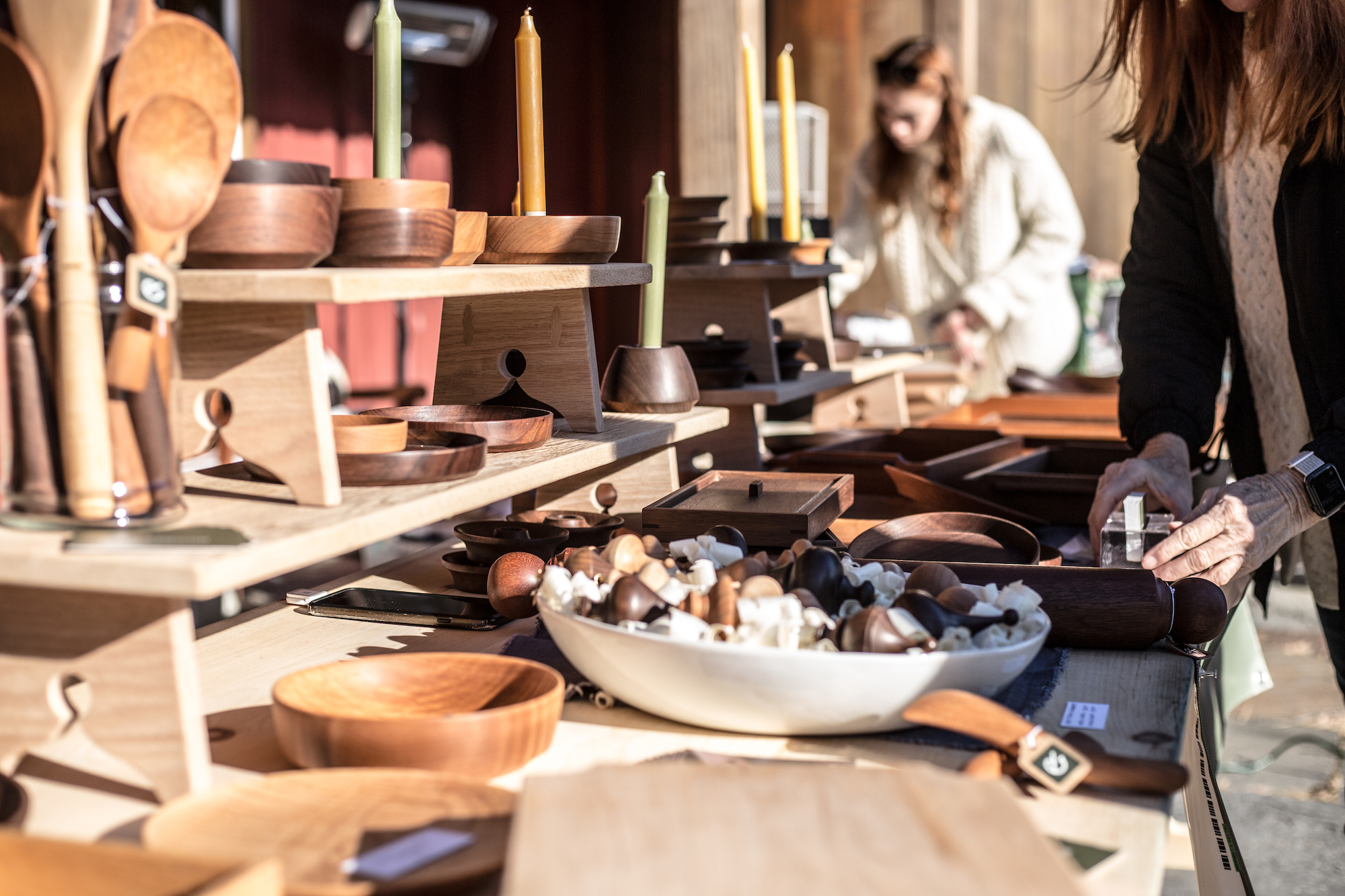
Together we love to spend time styling and shooting the finished pieces from our home. We use the photography to write a monthly newsletter, create blog posts, and post to our Instagram account. If all of that wasn't enough, we also sell our goods at maker markets during the summer and the holidays! I designed branded business cards, signage, stickers, postcards, and more to accompany our setup.
The rebrand has been a big success for us, both as a small business and as individuals. It has resulted in more consistent sales and increased engagement with our clients and our community. Above all, it has given us a better framework to talk about our work and express our values.