→ Logo Design, Print Materials, Digital Materials
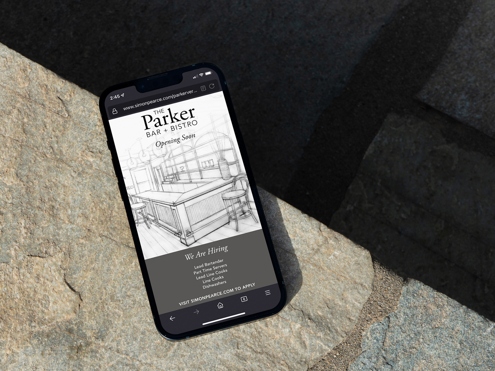
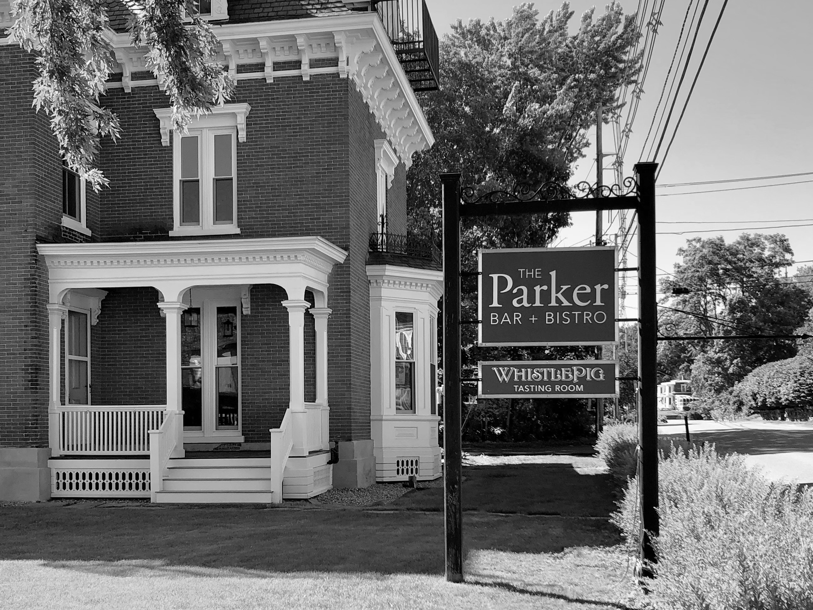
The Parker Bar + Bistro, sister restaurant to Simon Pearce, adjoins the company's Flagship Mill in Quechee, Vermont. Simon Pearce purchased the property in February 2020 and completed a full renovation of the building. It now houses the bistro (due to open soon), the WhistlePig Whiskey Parlour, and the pop-up donut shop The Farmer & The Bell.
It's rare that you get to work on a new logo design as an in-house designer — so when this project hit my desk at Simon Pearce, I was excited to dig in.
1792 Quechee Main Street, Quechee, VT 05059
“
We are thrilled to reunite the Parker property with the Mill at Simon Pearce. The Inn was the home of the Parker family — original owners of the woolen mill which is now the Simon Pearce Flagship location.
”
Jay Benson, CEO at Simon Pearce
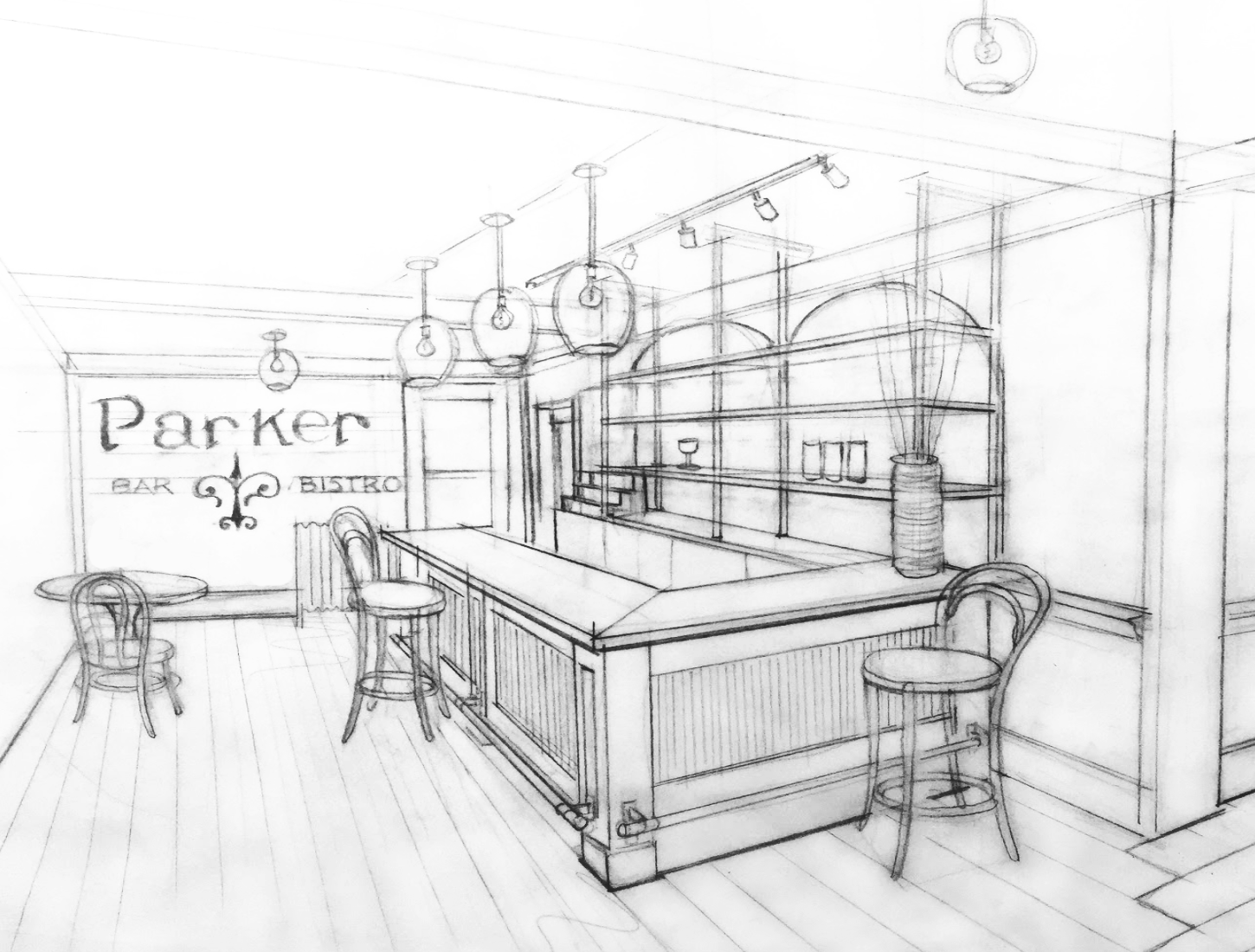
Sketch by James Murray
Logo Design
As part of the in-house design team, I was first tasked with the logo design. James Murray, VP of Product Design + Development at Simon Pearce, created preliminary sketches inspired by the building's architectural details — specifically the ornamental filagrees on the roof.
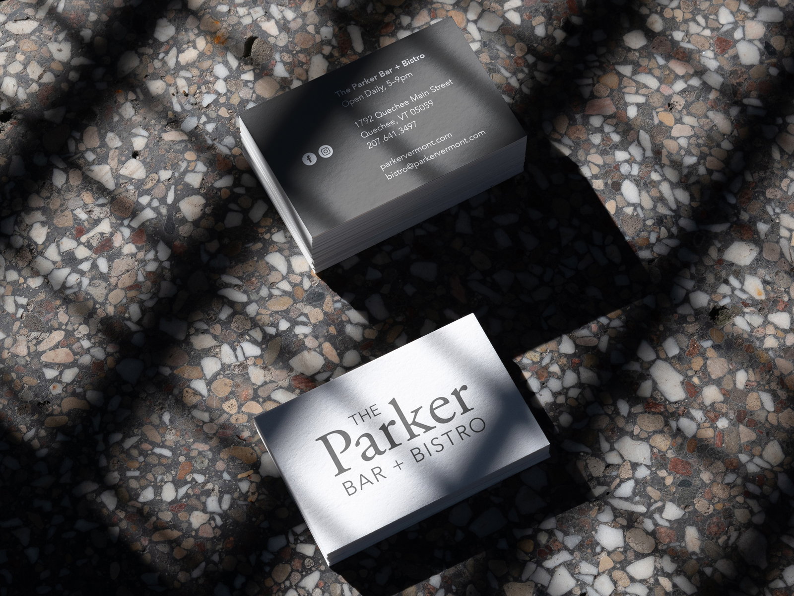
I started by digitally recreating the letterforms from his sketches and searching for typefaces with a similar, historical feel. After testing a few traditional and old-style serifs, Garamond was the final choice for the "Parker" wordmark. I tested a number of additional fonts and type treatments for "The" and for "Bar + Bistro" — serifs and sans serifs, small caps, uppercase and lowercase, italics and romans. Avenir in all caps was the final selection, as a nod to the type treatments we use at Simon Pearce.
Simultaneously, I worked on recreating the filagree icon from the sketch by James and from photos of the building. I pulled a few shapes from the new Parker logotype in Garamond to maintain similar proportions and curves. For example, the shoulder of the lowercase 'r' was used as an element in the icon. I tweaked the weight and proportions until the icon felt balanced with the wordmark.
I also tested a number of lockups with the filagree icon and wordmark together. Some were with "bar + bistro" and some without, knowing both versions would be needed for different applications.
Ultimately, the team decided to move forward with a text-only logotype. I was disappointed that the filagree concept didn't stick, but I loved the process.

Color & Collateral
The predetermined color palette for The Parker is monotone with the primary color being Iron Mountain Gray — a secondary color from the Simon Pearce palette.
Once the logo was finalized, I created street signs, interior signs, menus, ads, business cards, and more using the new assets.
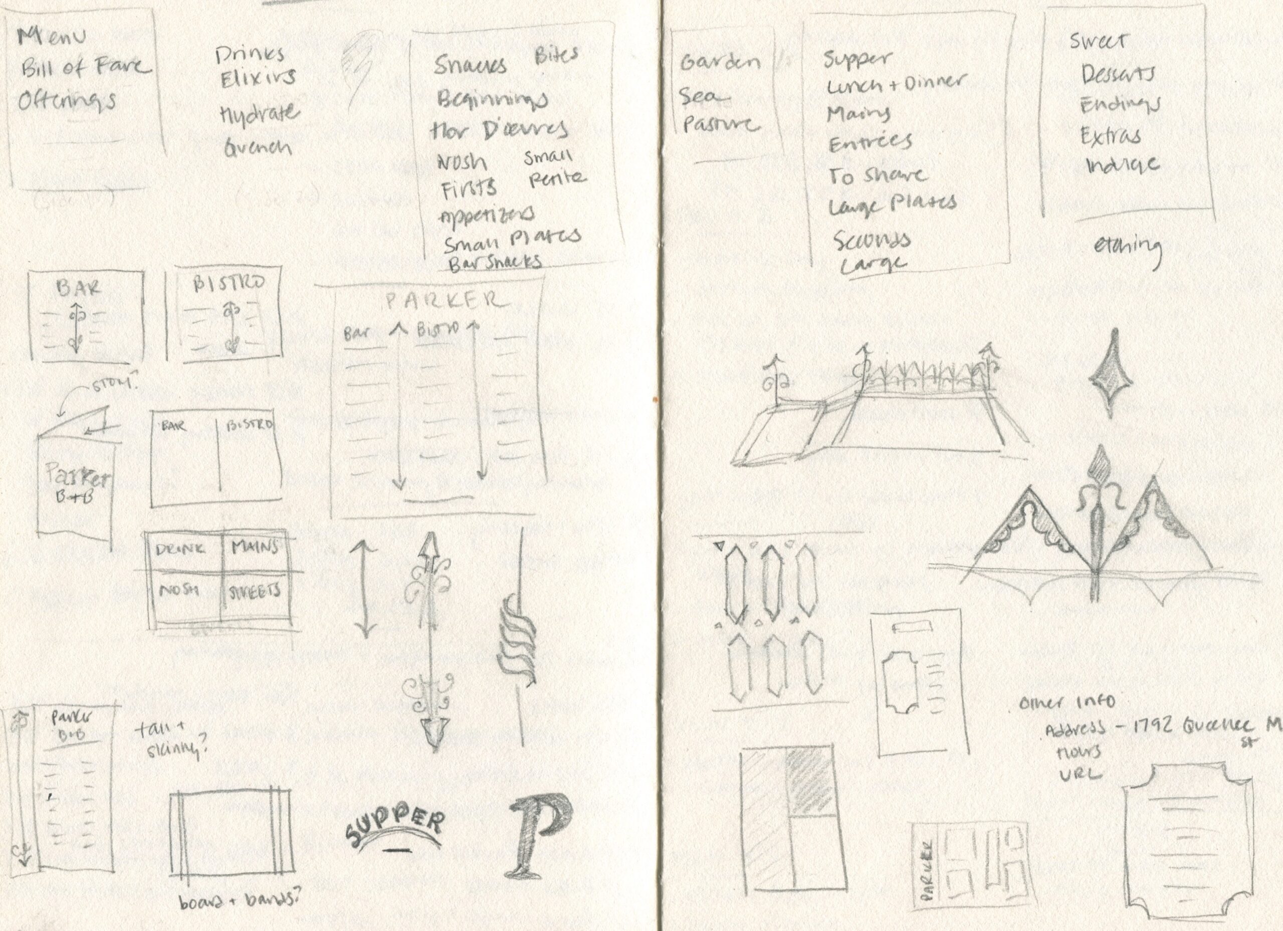
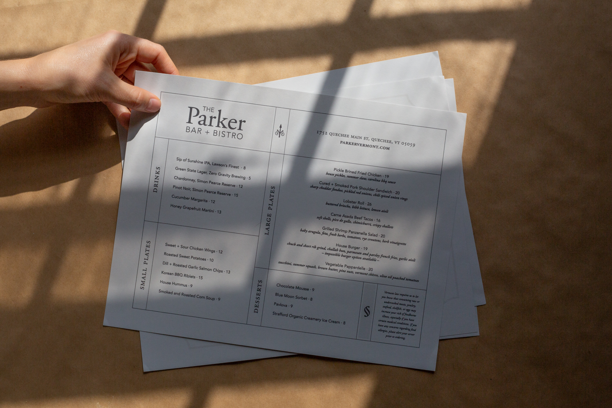
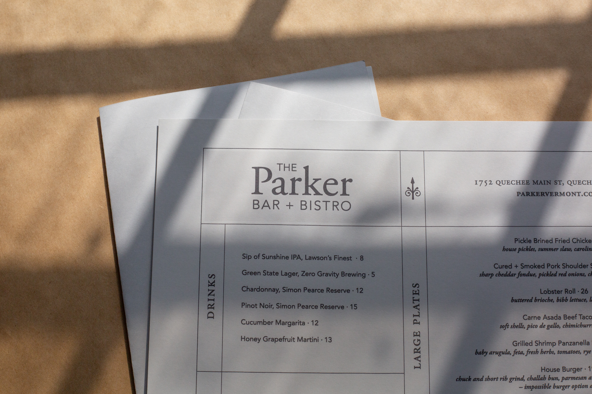
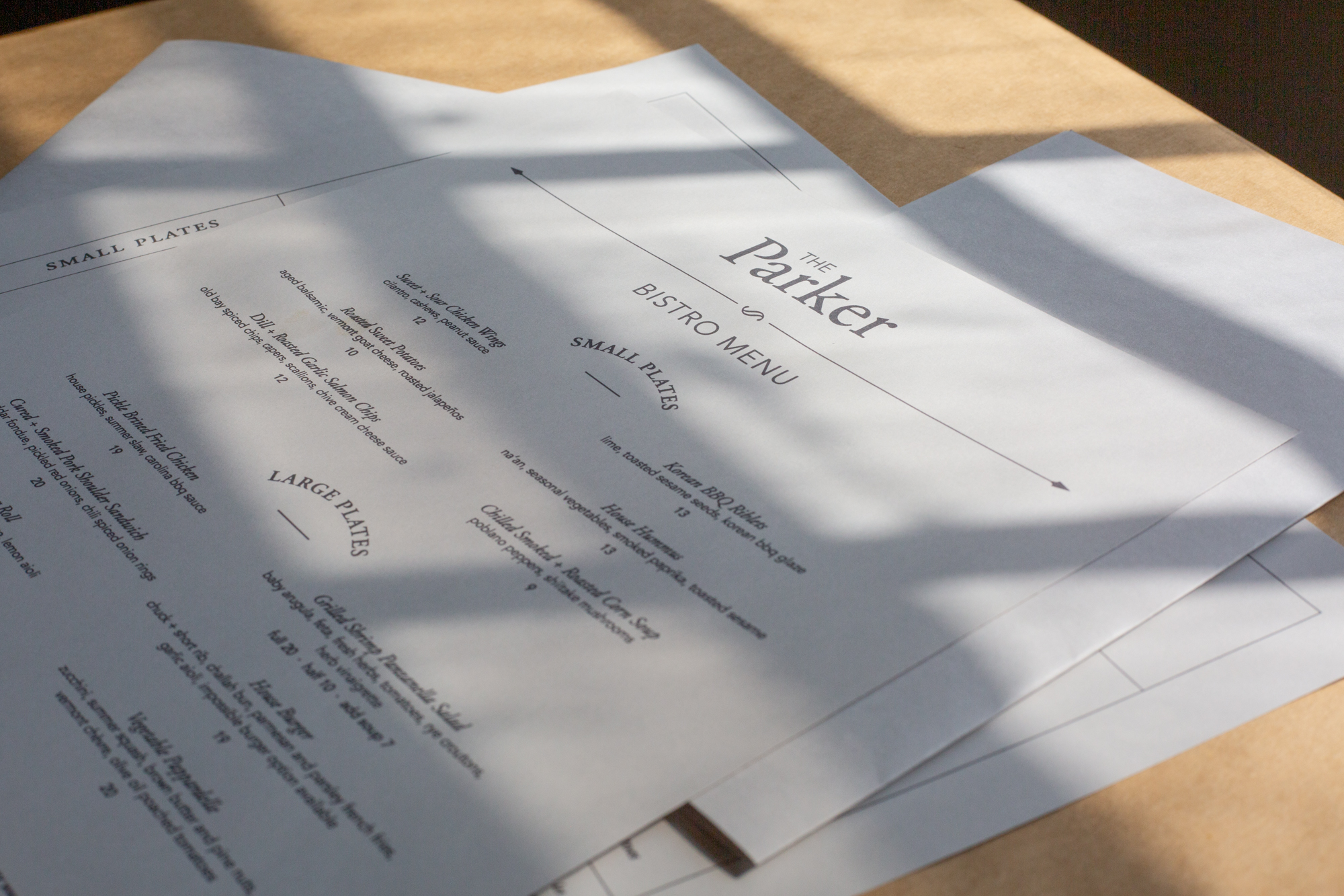
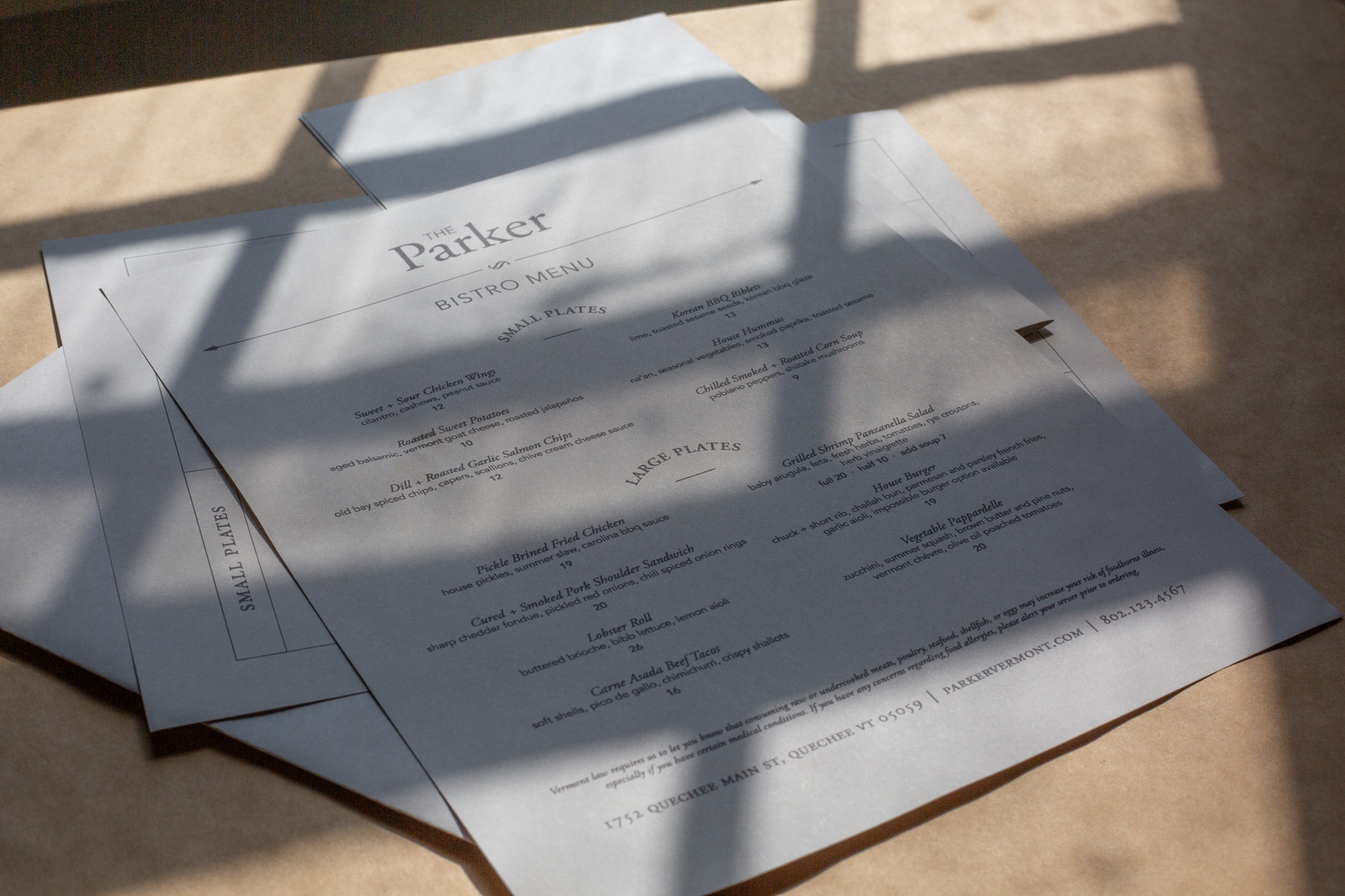
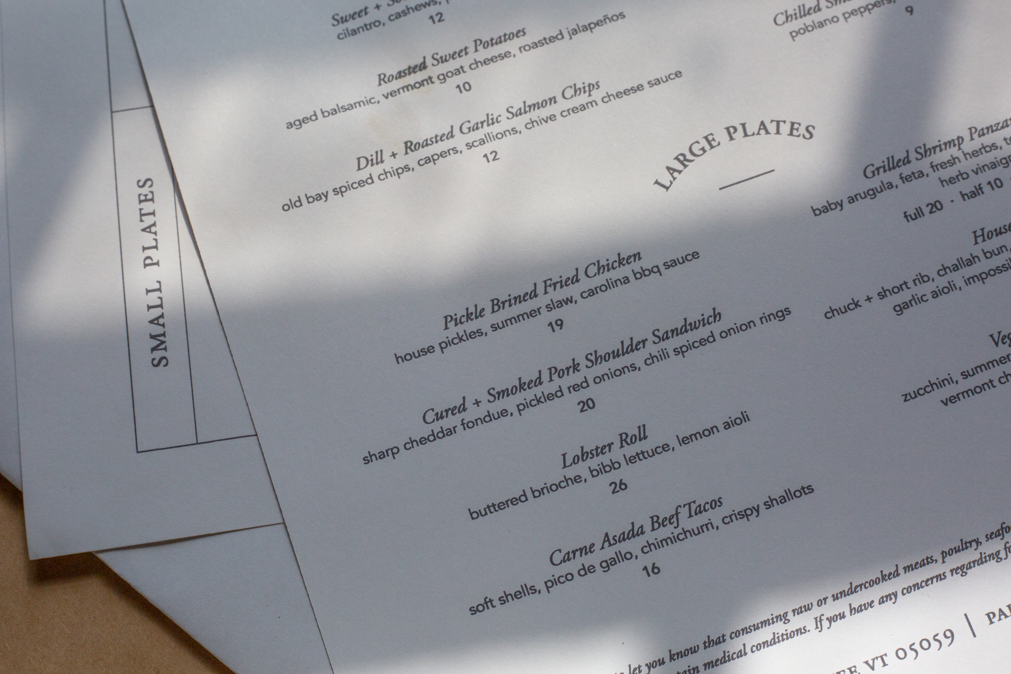
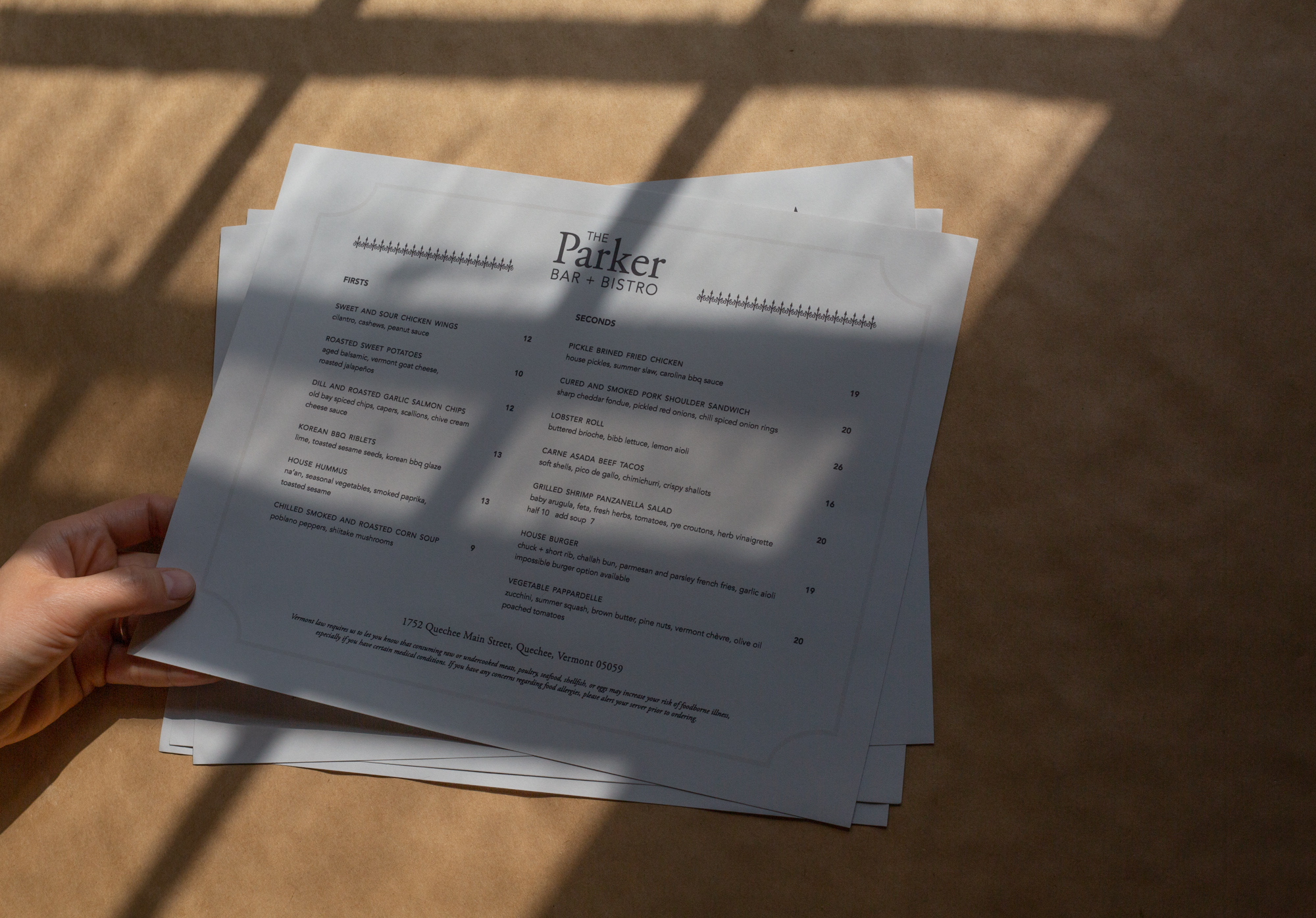
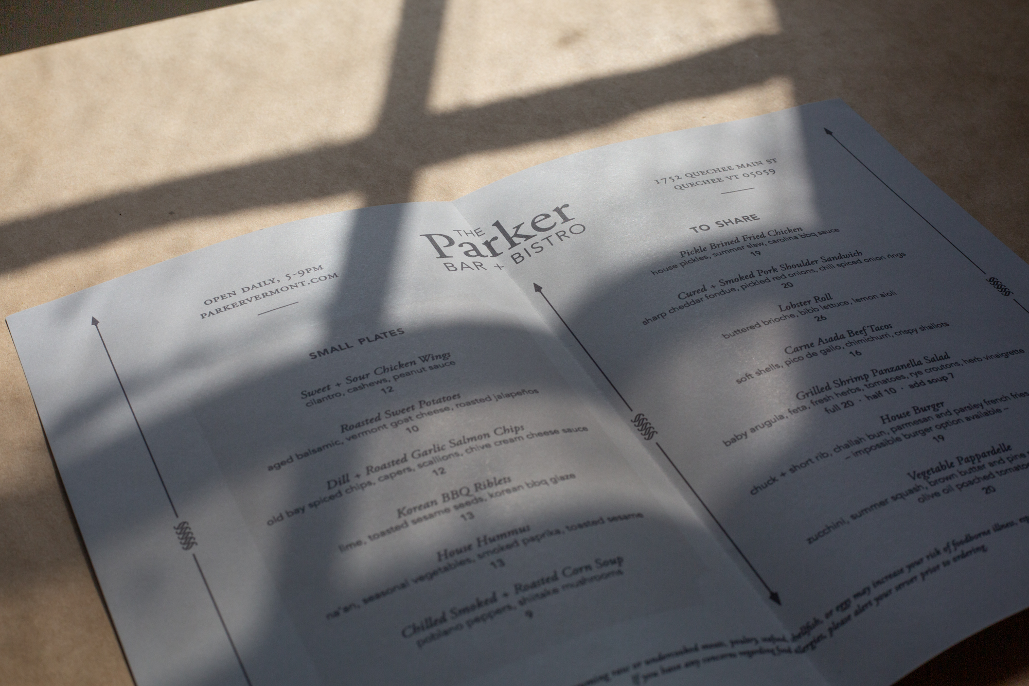
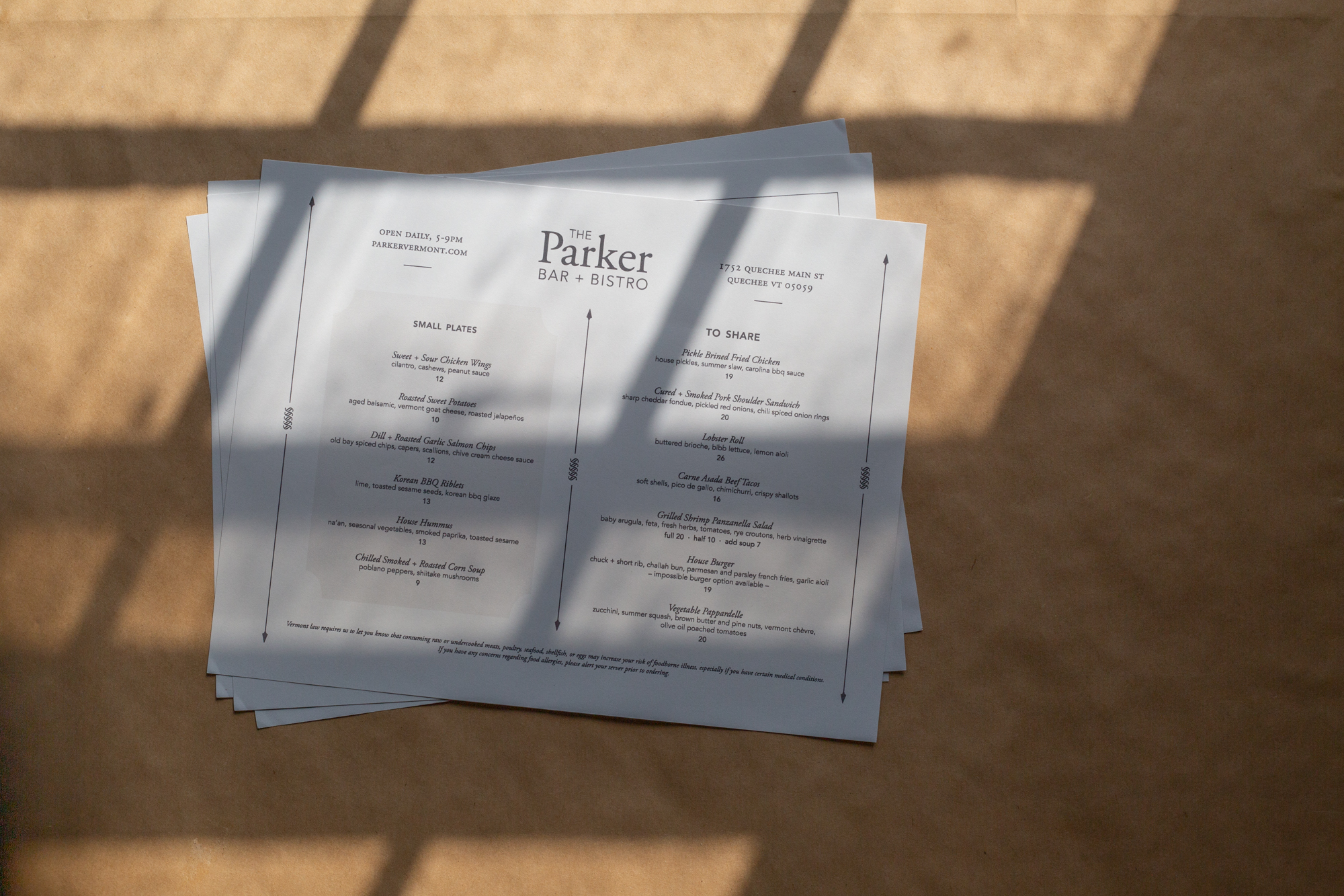
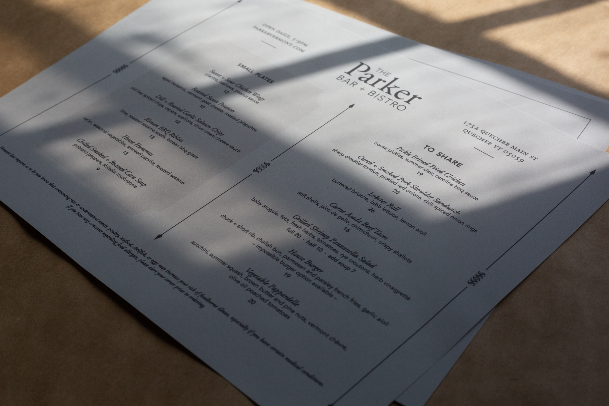
Menus
As a continuation of the logo design, the menus pulled inspiration from the architectural elements at the Parker property. I created a number of arrows and other graphics with a similar style to the filagree. I also utilized inspiration pulled together by the team. After trying out a few classic bistro-inspired designs, we ultimately decided on a cleaner, minimal version.
Knowing these menus would be updated and printed in-house by the Parker team, I also researched on-brand paper types and found options in the gray palette that could be easily ordered by the restaurant. The design is a standard 11 x 8.5 for easy printing, and I provided a template that can be updated in house as well.
Sketch by James Murray
Created at Simon Pearce with direction from + in collaboration with:
Deb Ivy — Vice President of Brand Experience
James Murray — Vice President of Product Design & Development
Mila Hailperin — Art Director