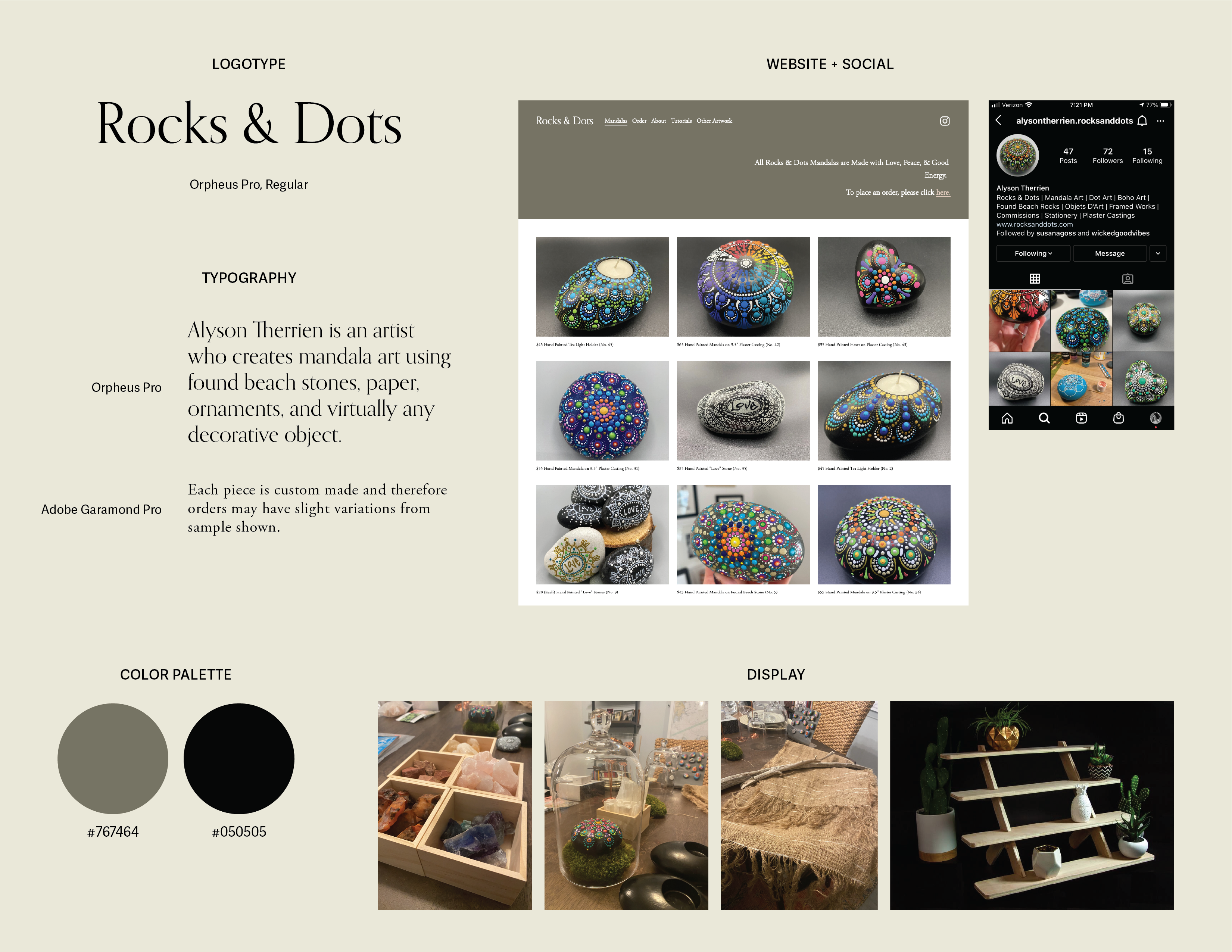
→ Logo Design, Business Cards, Signage
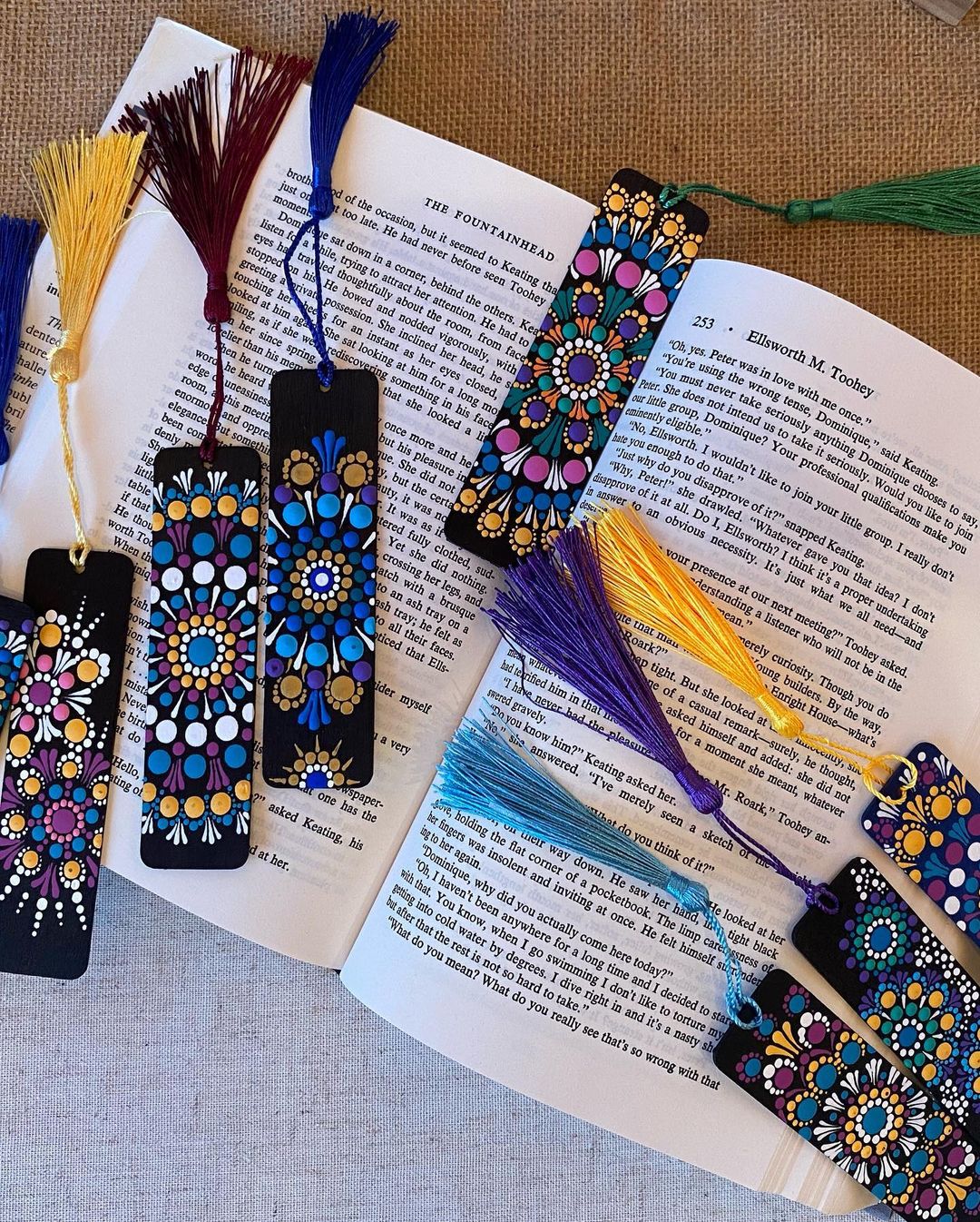
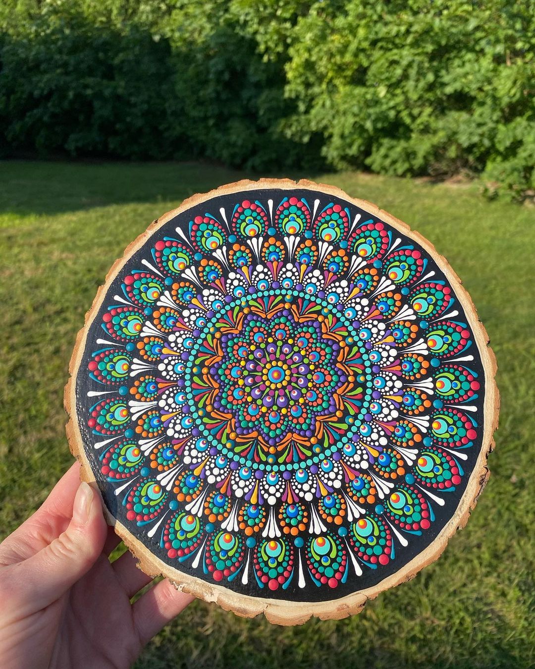
Alyson Therrian, a Massachusetts-based mandala artist, started selling her work under Rocks & Dots in 2021. She creates pieces using found beach stones, paper, ornaments, and decorative objects. We connected through a mutual friend years ago, and we both come from the same architectural background.
Alyson approached me to design a logo and print materials leading up to summer maker markets. As a fellow enthusiast of handmade wares, she was a dream client and I was thrilled to work with her.
Existing Brand & Mood Board
The first step was to get an understanding of the brand that Alyson was looking to create. I pulled together a board of her existing assets as a starting point. I also asked her to send me any imagery, terminology, and other brands she was inspired by. Using those assets, I created a mood board to spark inspiration for the logo design and ensure we were on the same page. I also included some preliminary thoughts on color. The original intent here was to aim for an apothecary feel.
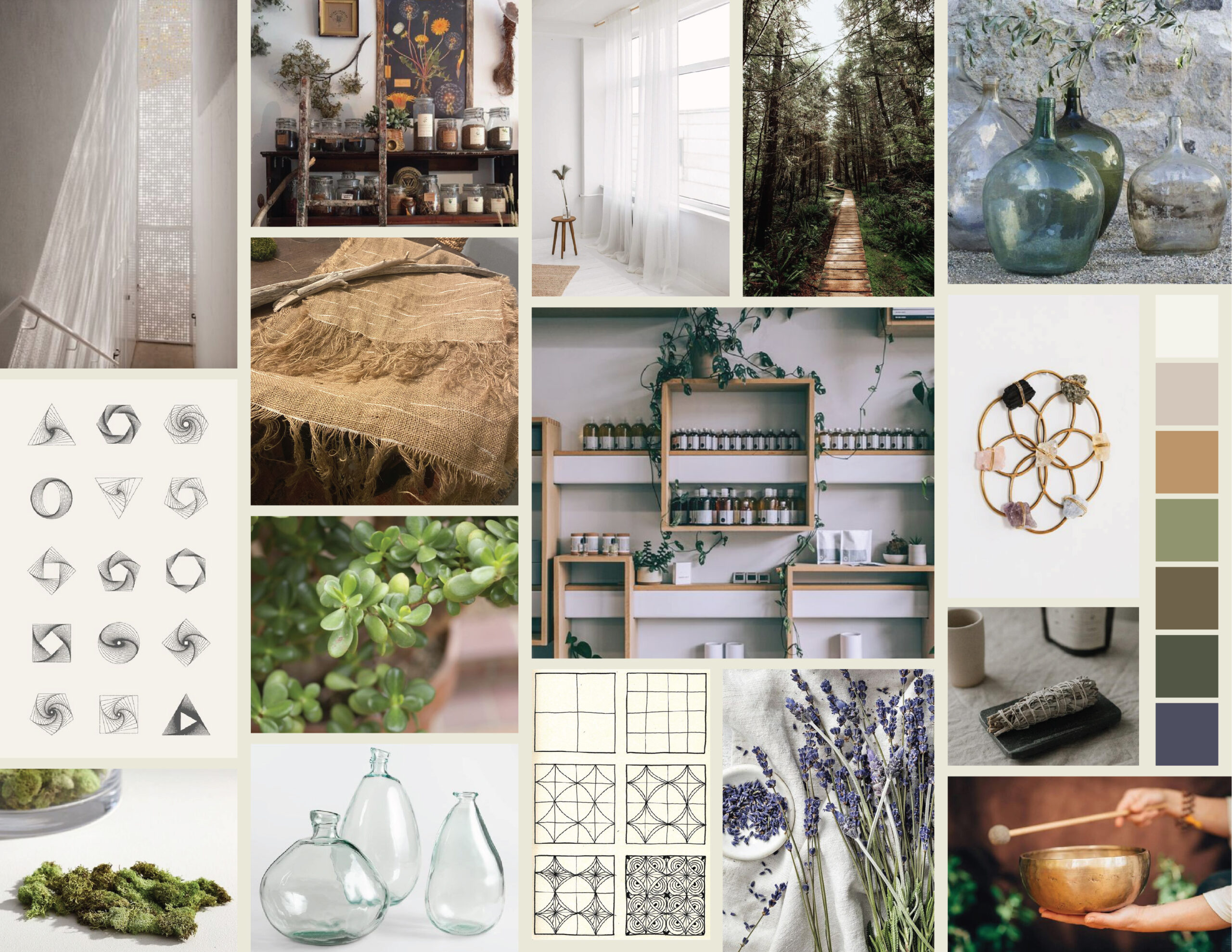
Zen
Glee
Pattern
Color
Beauty
Order
Universal
Peace
Love
Crystal grids
Fractal geometry
Zentangle
Smudge sticks
Naturopathy
Old glass bottles
Chakras
Tibetan singing bowls
Trail walking
Moss
Fog
Ethereal landscapes
Crushed leaves
Lavender
Jade plants
Asian art
Native American art
Linen
Doodling
Drawing in chalk
Sheer curtains
Filtered light
Aztec pottery
Boho decor
Logo Design
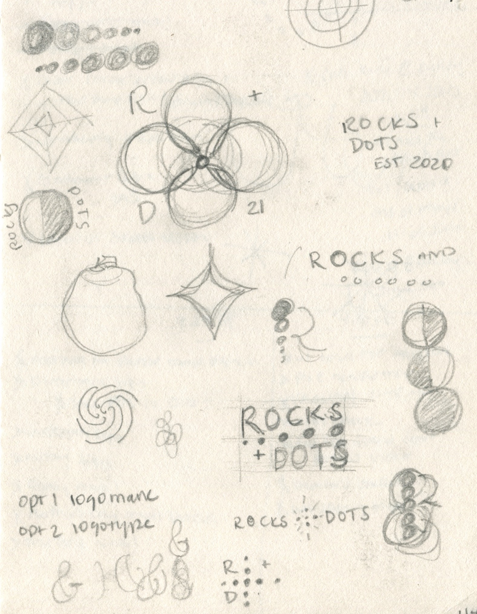
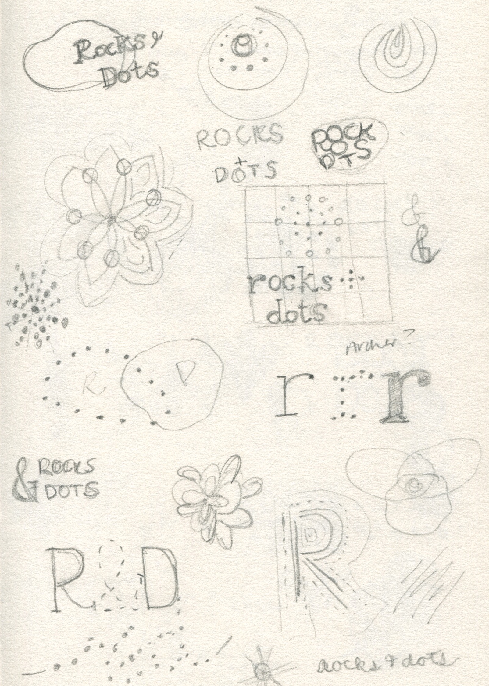
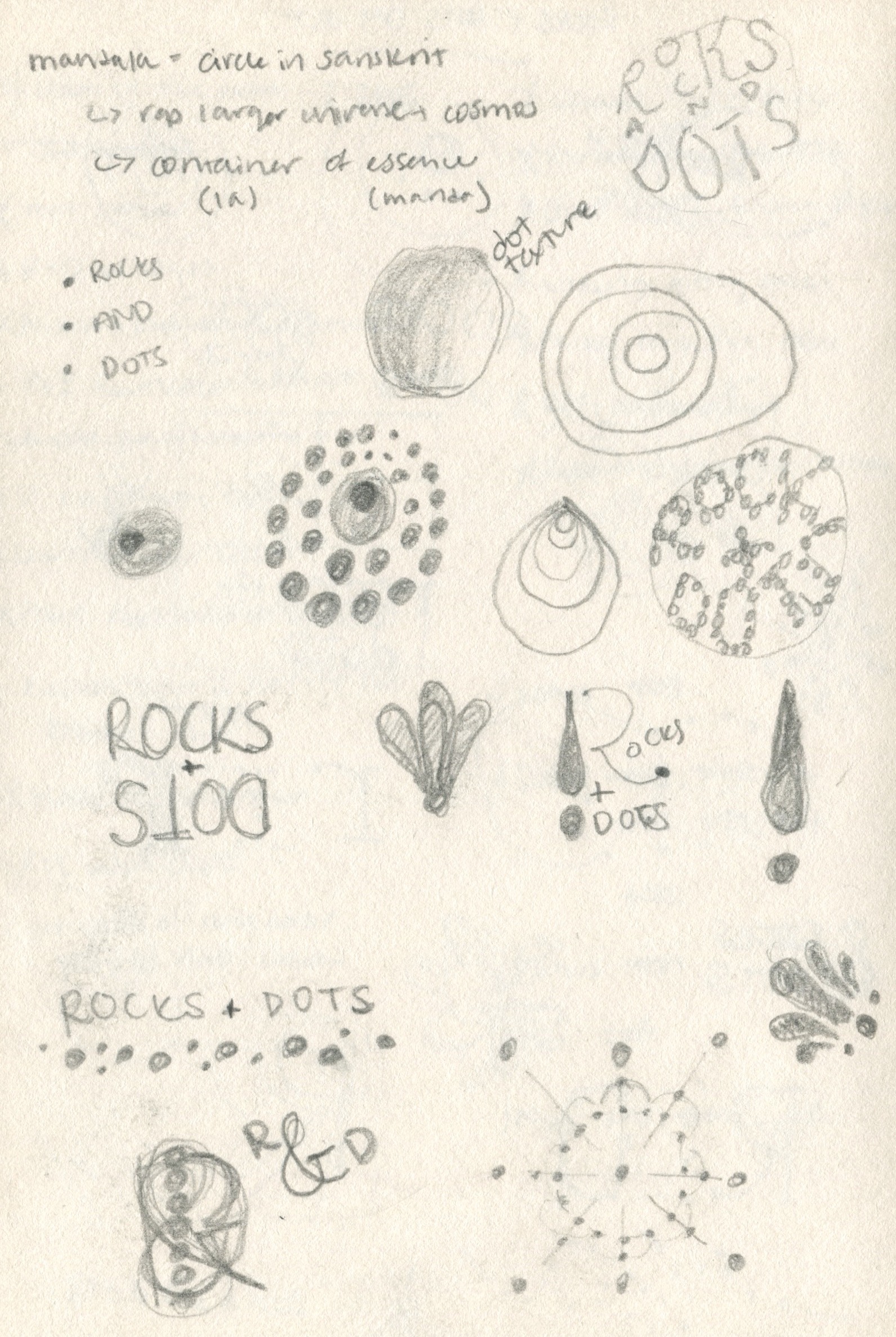
I began with quick, rough sketches in my notebook — drawing any ideas that came to mind. I selected a few, translated them to Illustrator, and continued iterating digitally. I explored a variety of concepts, shapes, patterns, and layouts. Once I narrowed it down to a handful of options, I refined them a bit further — eventually reaching the three below that I sent to Alyson as version 1.
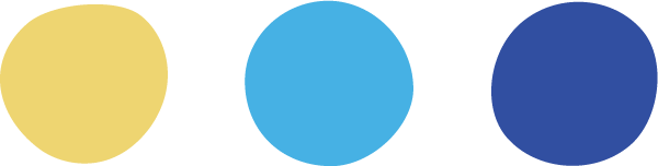
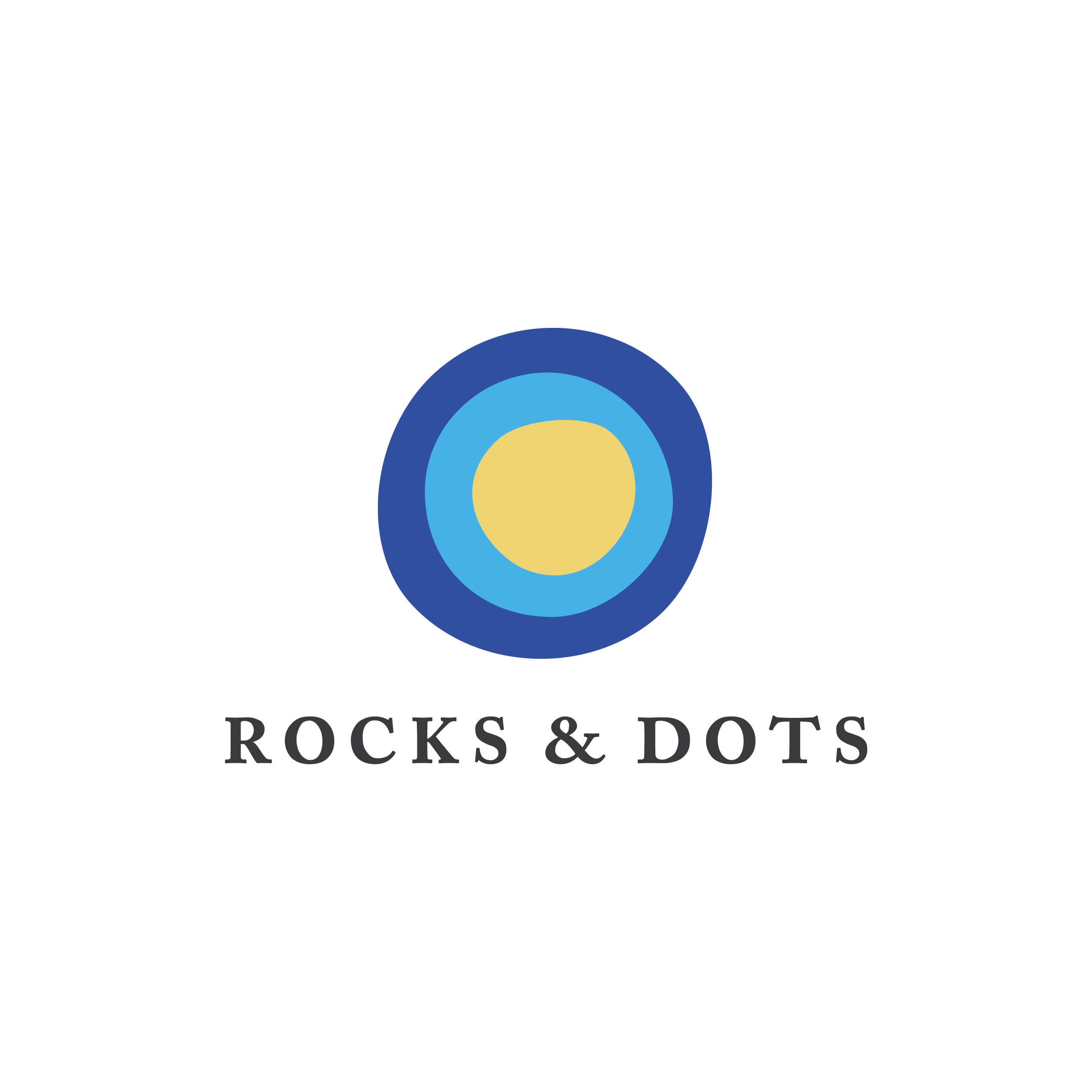
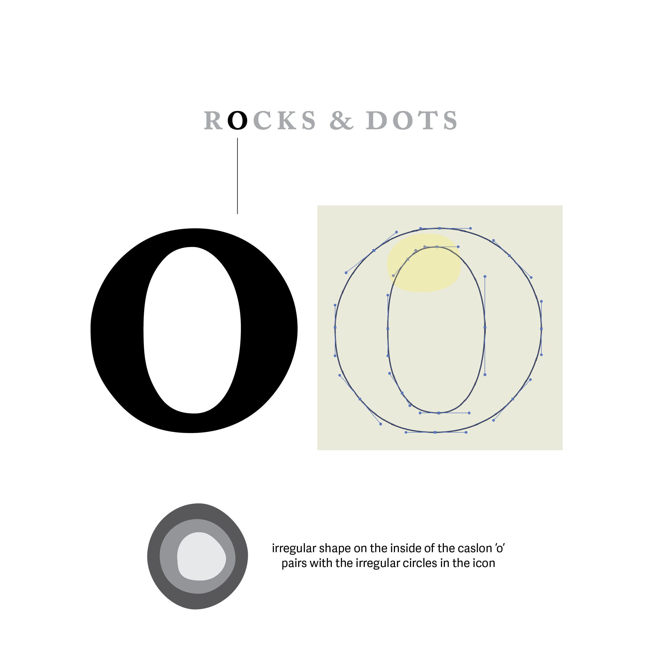
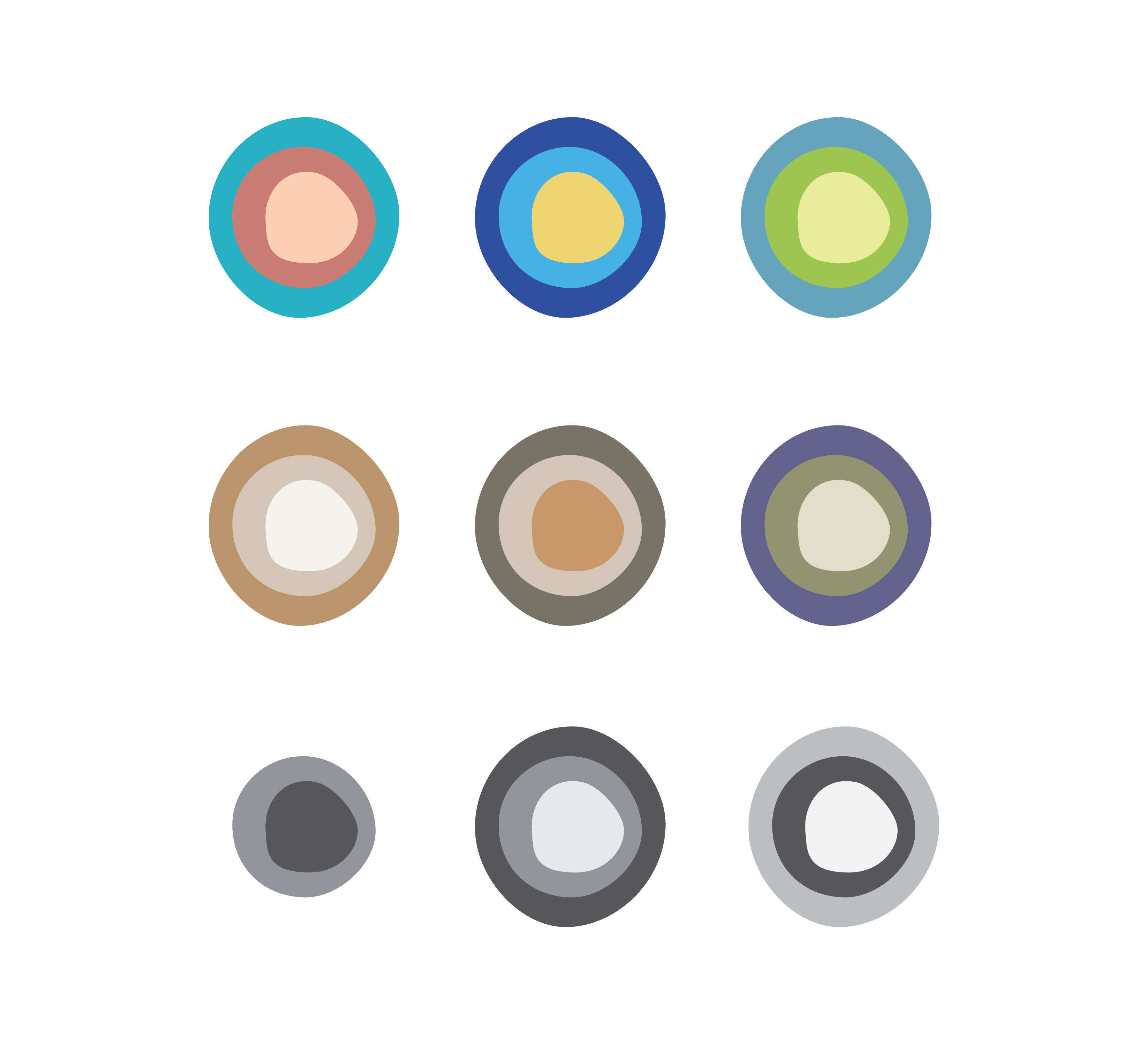
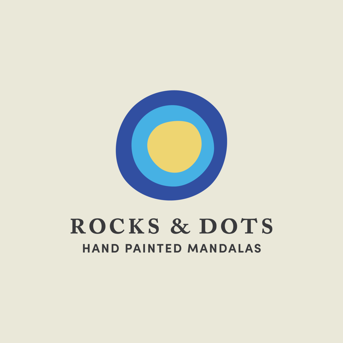
Option 1 focuses on the dots themselves — handpainted, slightly irregular, concentric circles that reflect the handmade but meticulous nature of the work. I pulled the colors from Alyson's artwork and lowered the brightness a bit to skew closer to the elegant and earthy feel she was hoping to achieve. With "classic" being another brand goal, I paired the icon with Caslon — a humanist serif typeface that mimics handwritten calligraphy. Up close, the Caslon "o" has a similar handmade quality that ties this concept together (see the diagram below).
Option 2 is a logotype with a geometric sans serif typeface that mimics the dots and the geometric patterns of the mandalas.
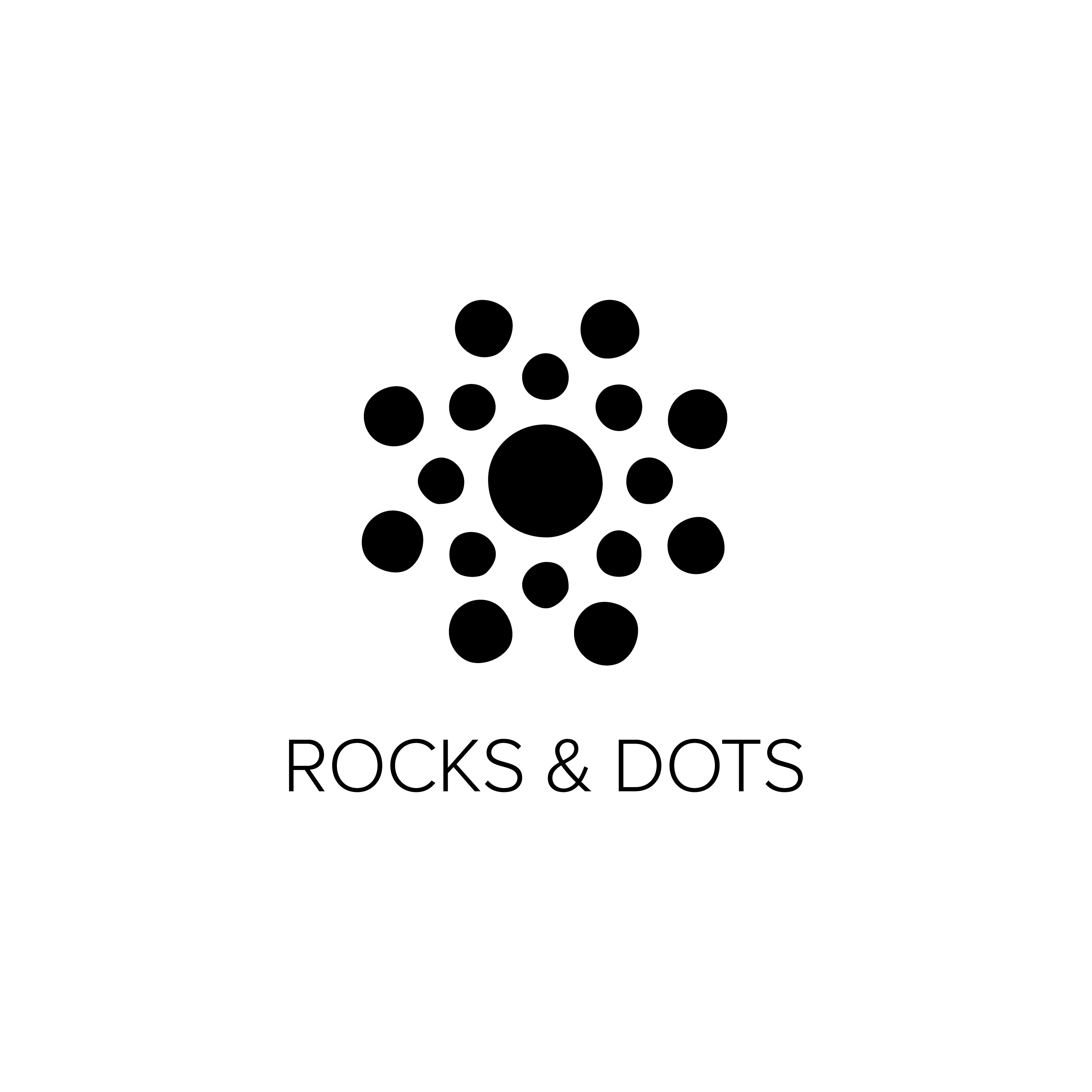
Option 3 is a representation of the mandala patterns using the irregular circles from option 1. Rather than focusing on a single dot, it focuses on a small grouping of them. The trickiest part of this option was deciding how many dots to include so that it would read at both small and large scales without feeling cluttered.
Option 1
Option 2
Option 3
In Version 2, we continued with Option 1 but explored additional typefaces. I mocked up several versions for her to choose from and added the "hand painted mandalas" tagline.
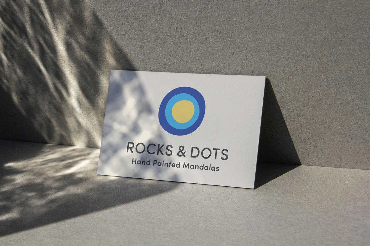
For the final design, I scaled down the icon to make it more proportional to the text, tweaked the kerning (letterspacing), and fine-tuned the curves in the circles.
I also made a variety of lockups (logo layouts) for different uses — the full logo as the primary, a horizontal layout for the signage, the text-only logotype, and the icon for social media.
The end result skews more toward bright and modern and is less focused on the earthy, apothecary feel than originally intended. To us, however, it is a more accurate representation of the work. It's colorful and perfectly imprecise — a reflection of creating the mandalas by hand.
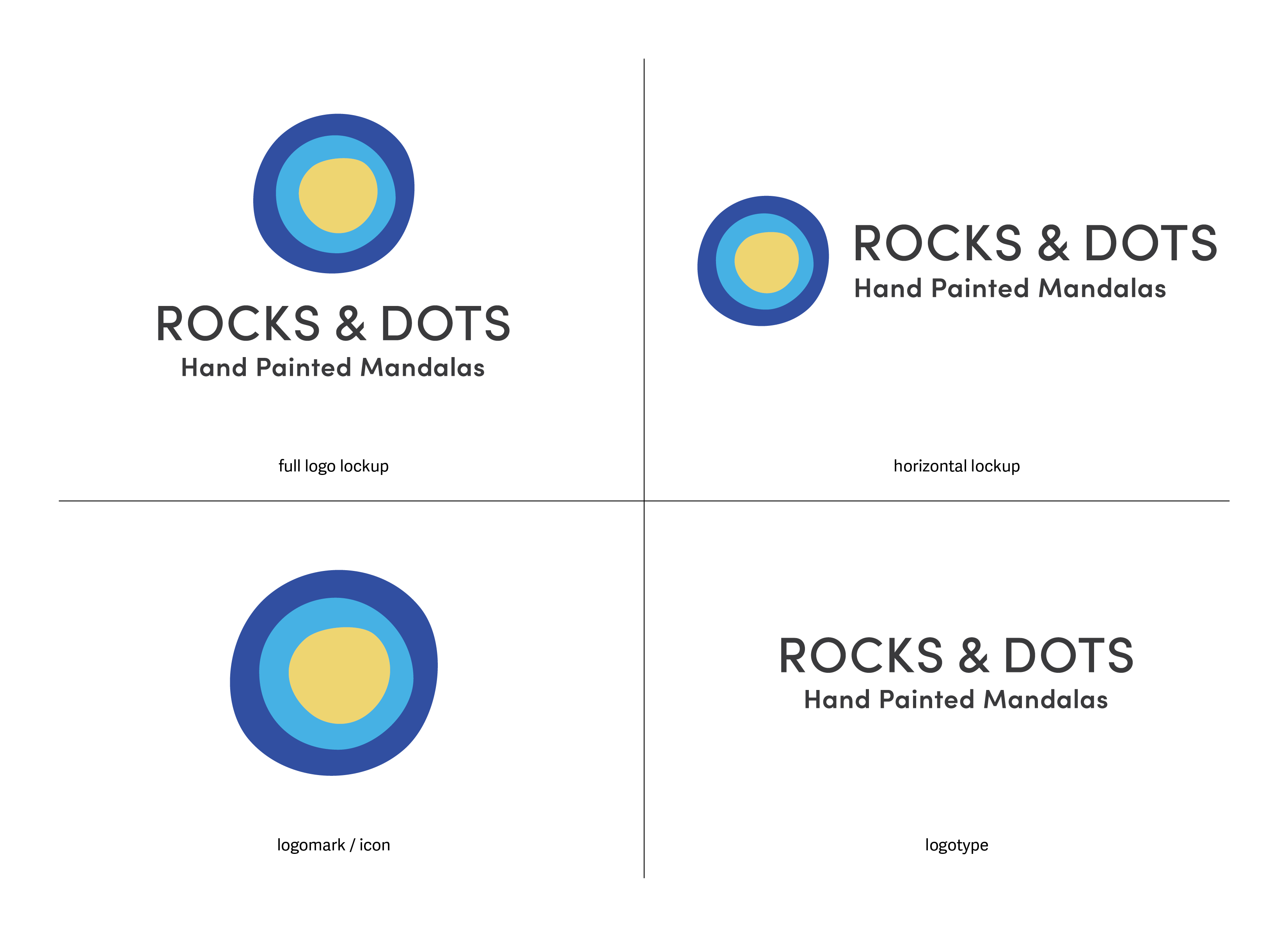
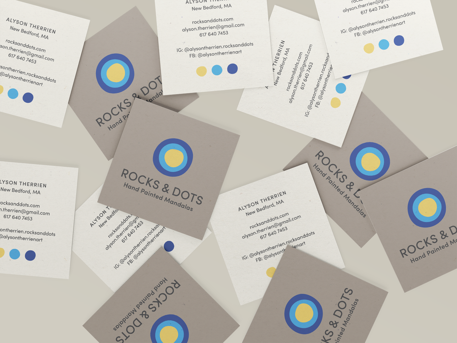
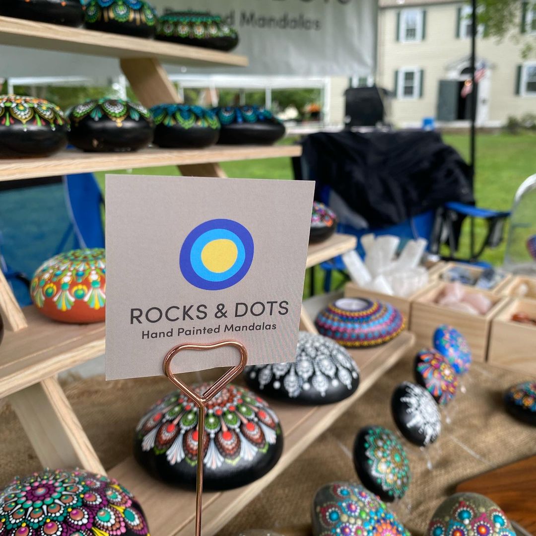
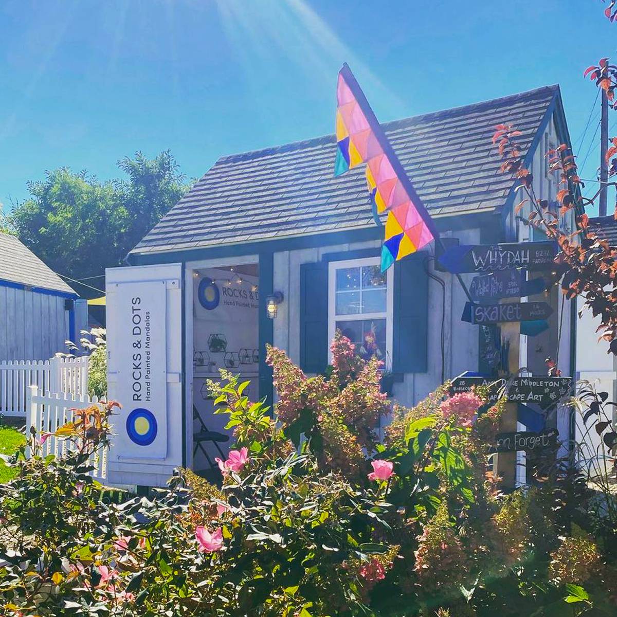
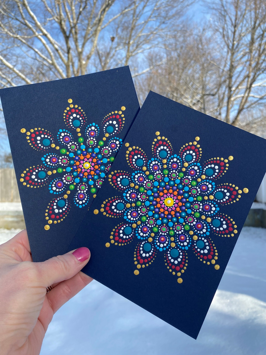
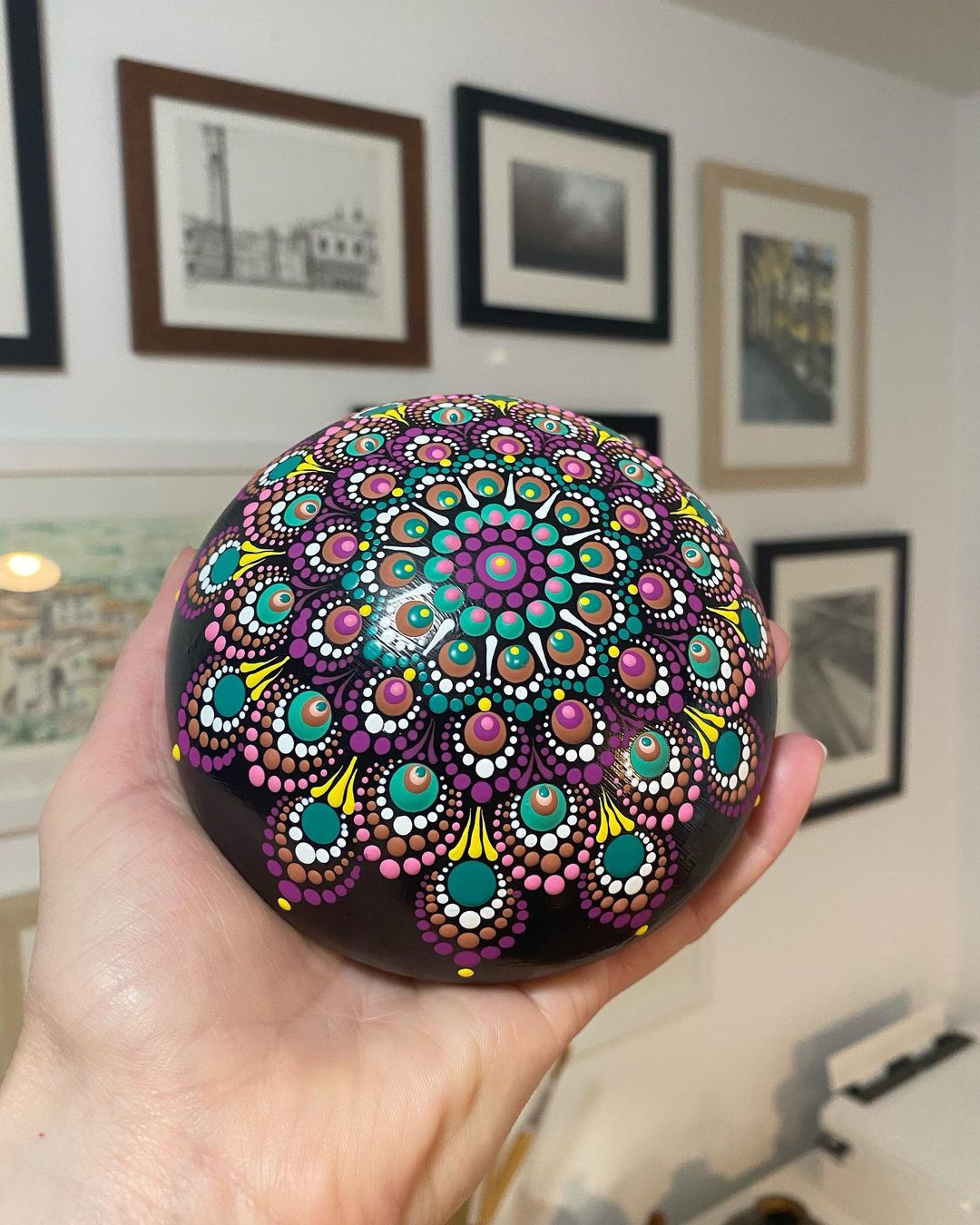
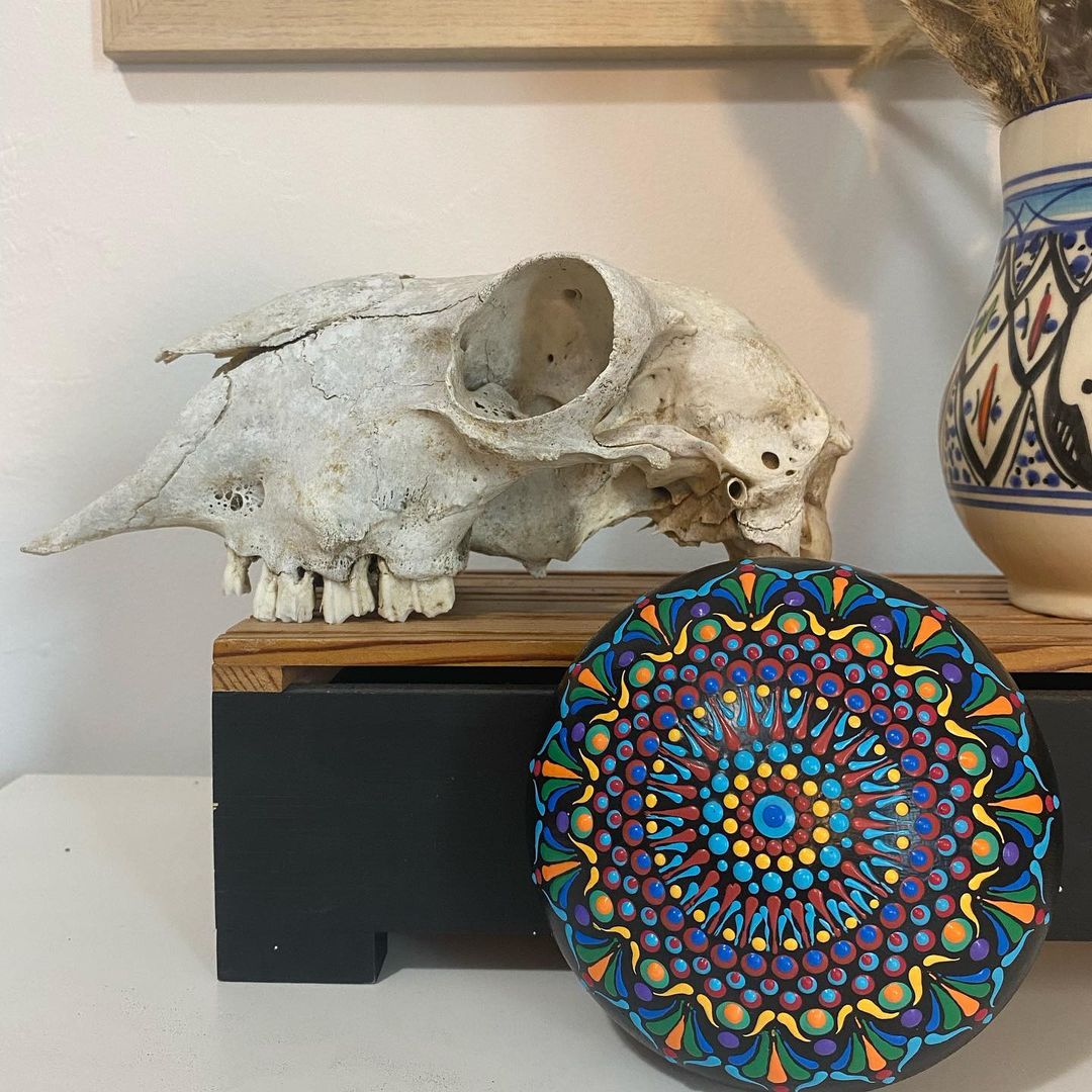
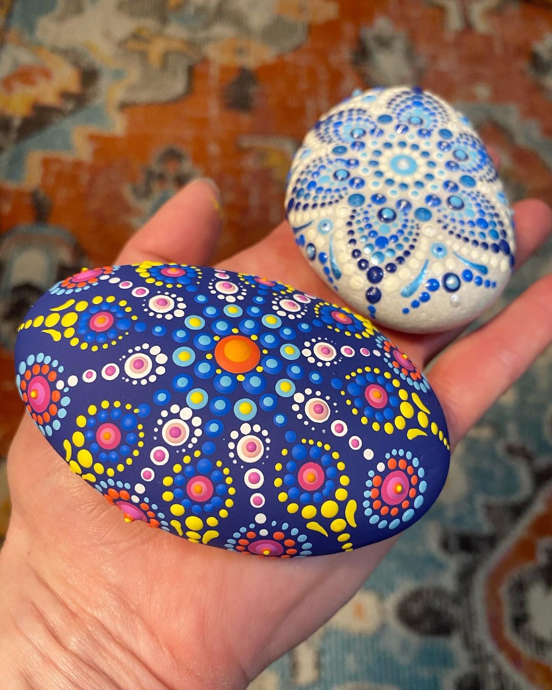
Photo by Alyson Therrien
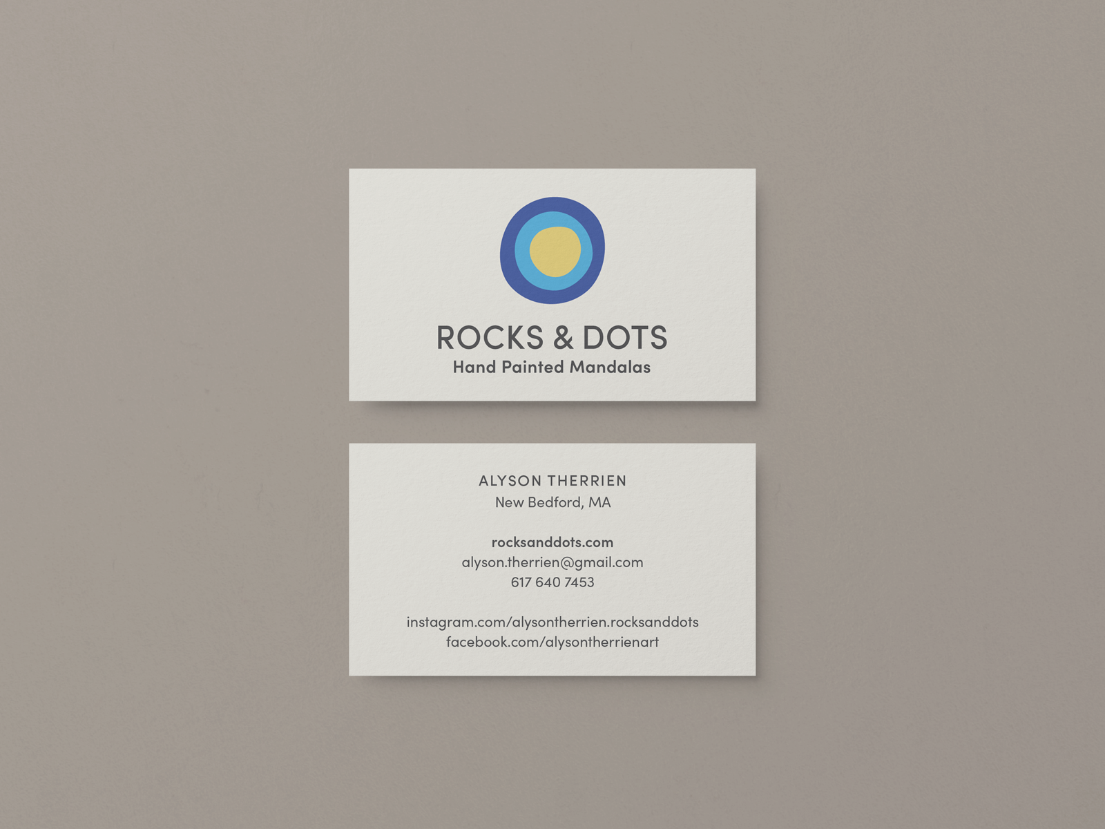
Business Cards
Once the logo was designed, I created three options for the business cards:
Option 1: Standard size — a clean and simple version with the full logo on the front and text only on the back.
Option 2: Large — I pulled in the earthy colors from the mood board as a secondary palette to tie this back to the original apothecary feel. I also created a graphic accent from the dots.
Option 3: Square — Also using the mood board colors and graphic accents here, but a bit more subtle. This one was the final selection.
← scroll →
Photos by Alyson Therrien